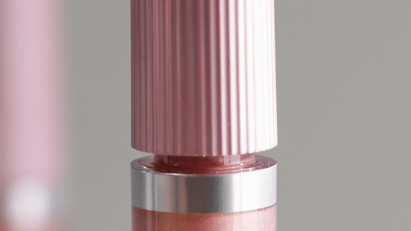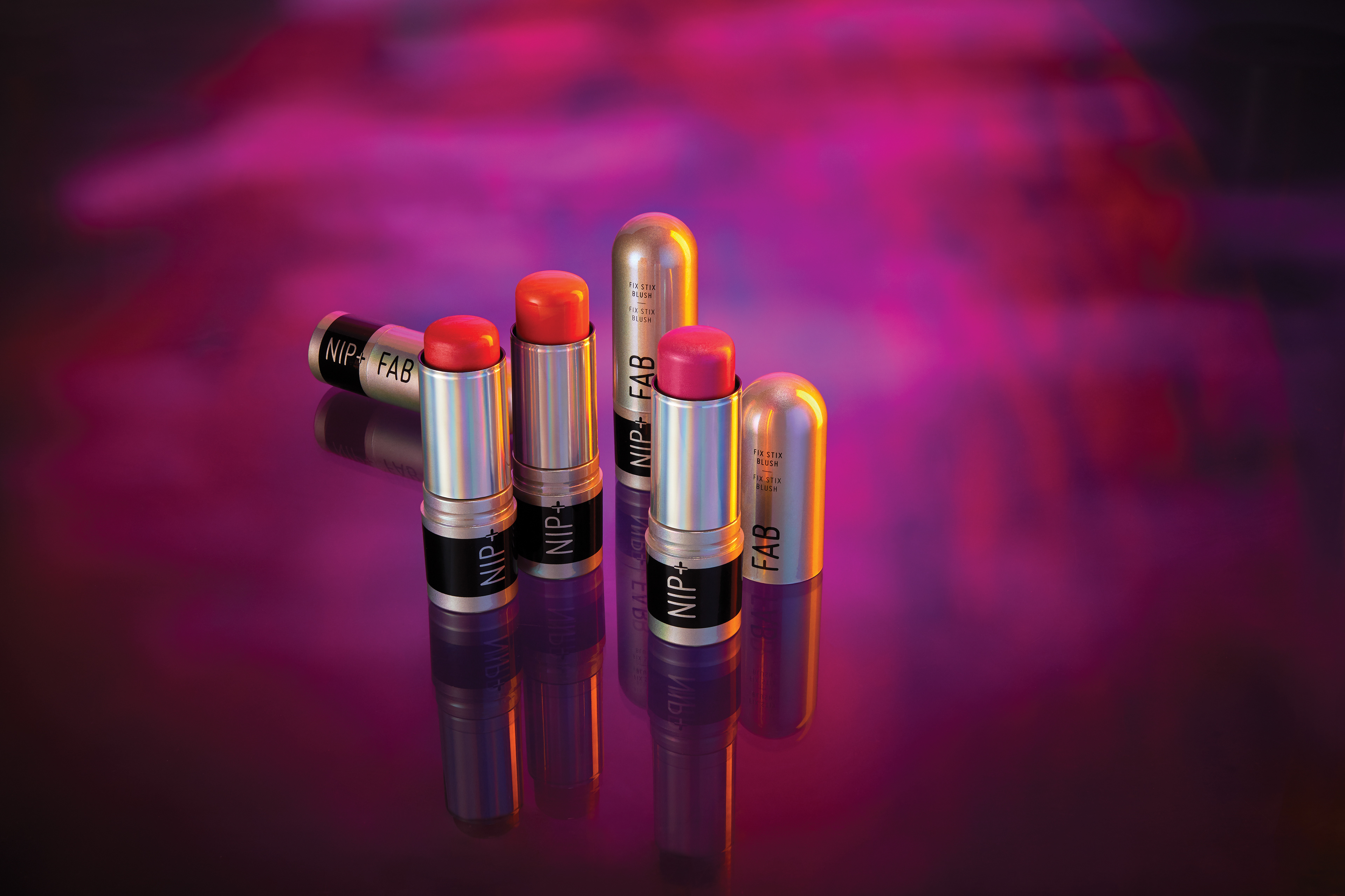
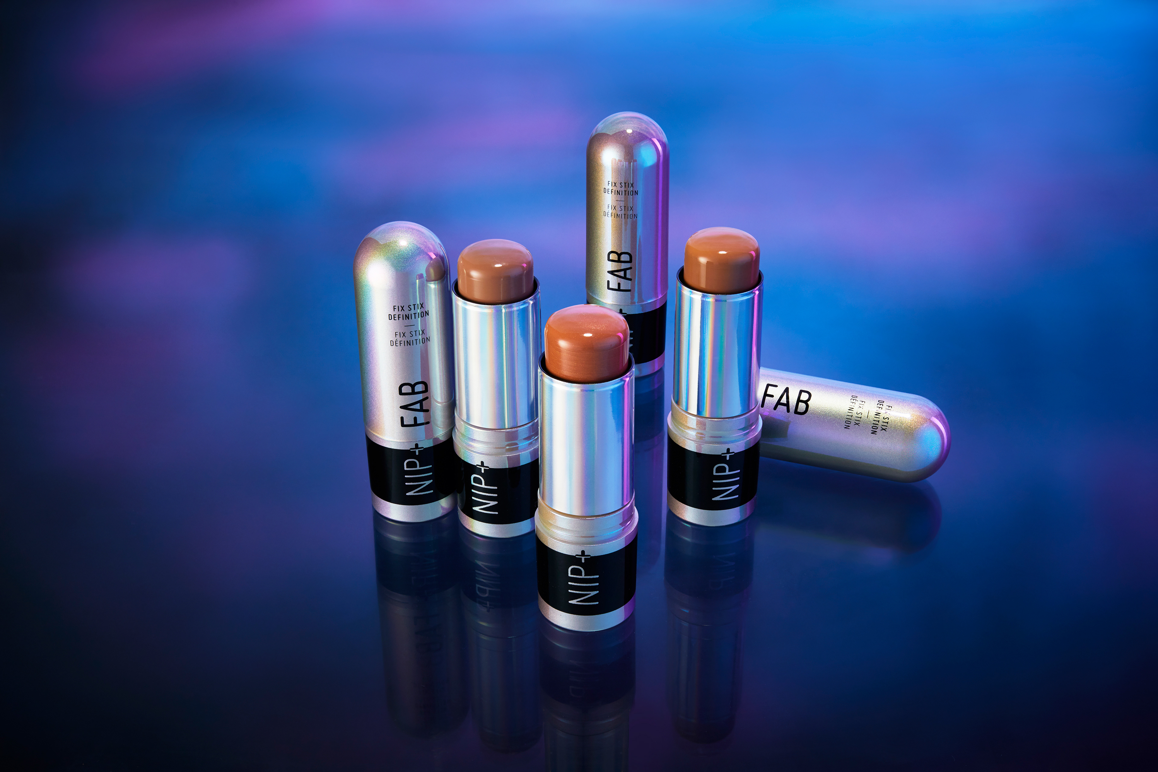
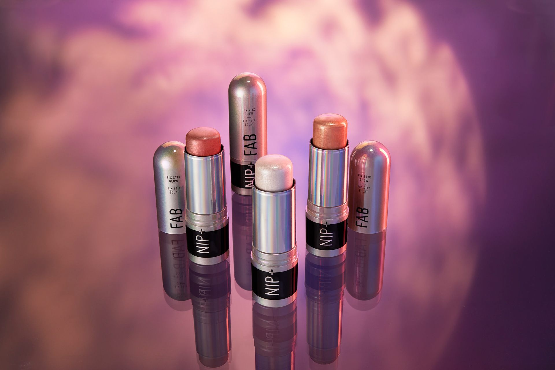


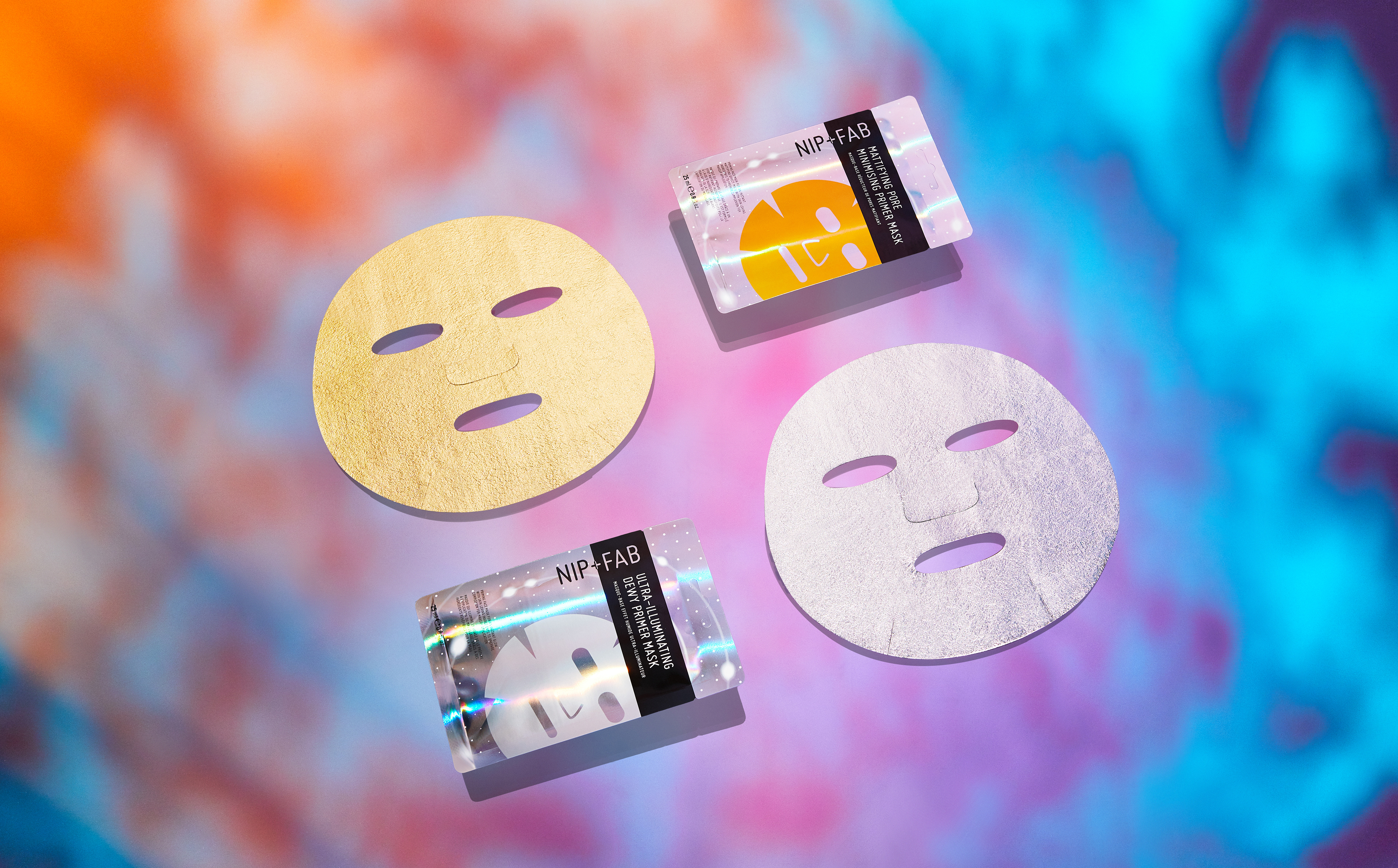

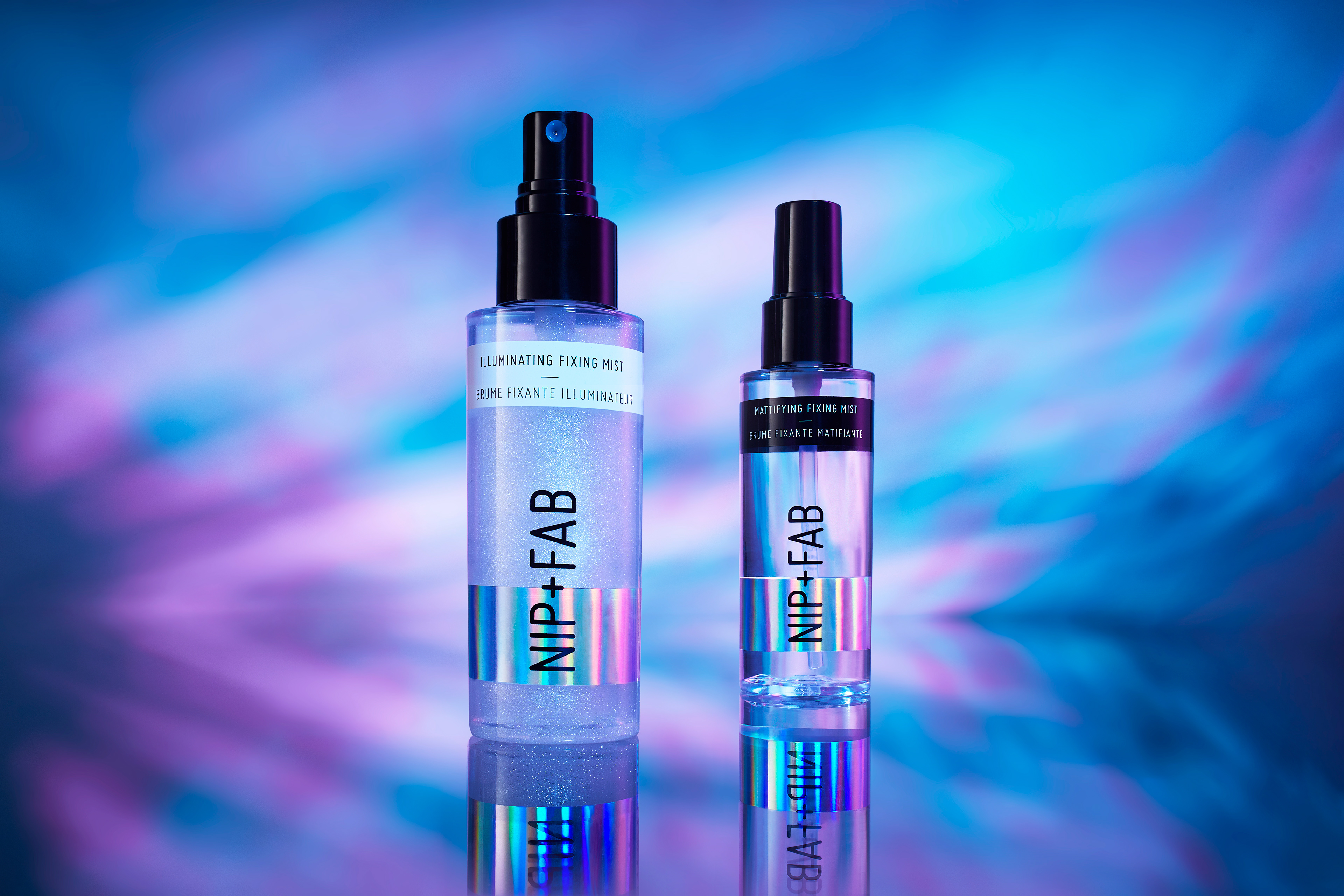
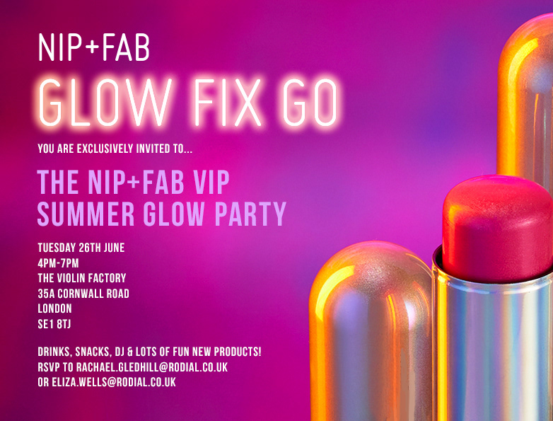

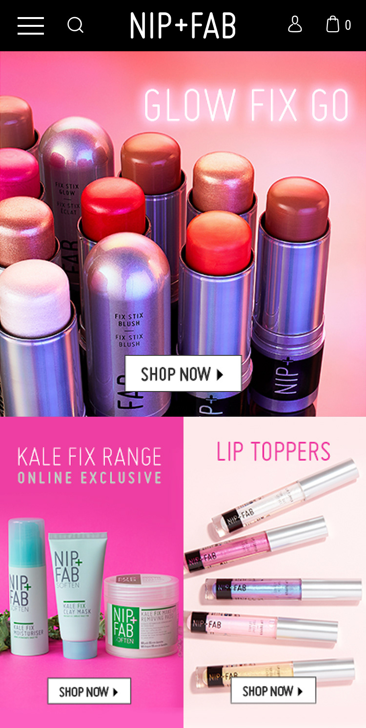
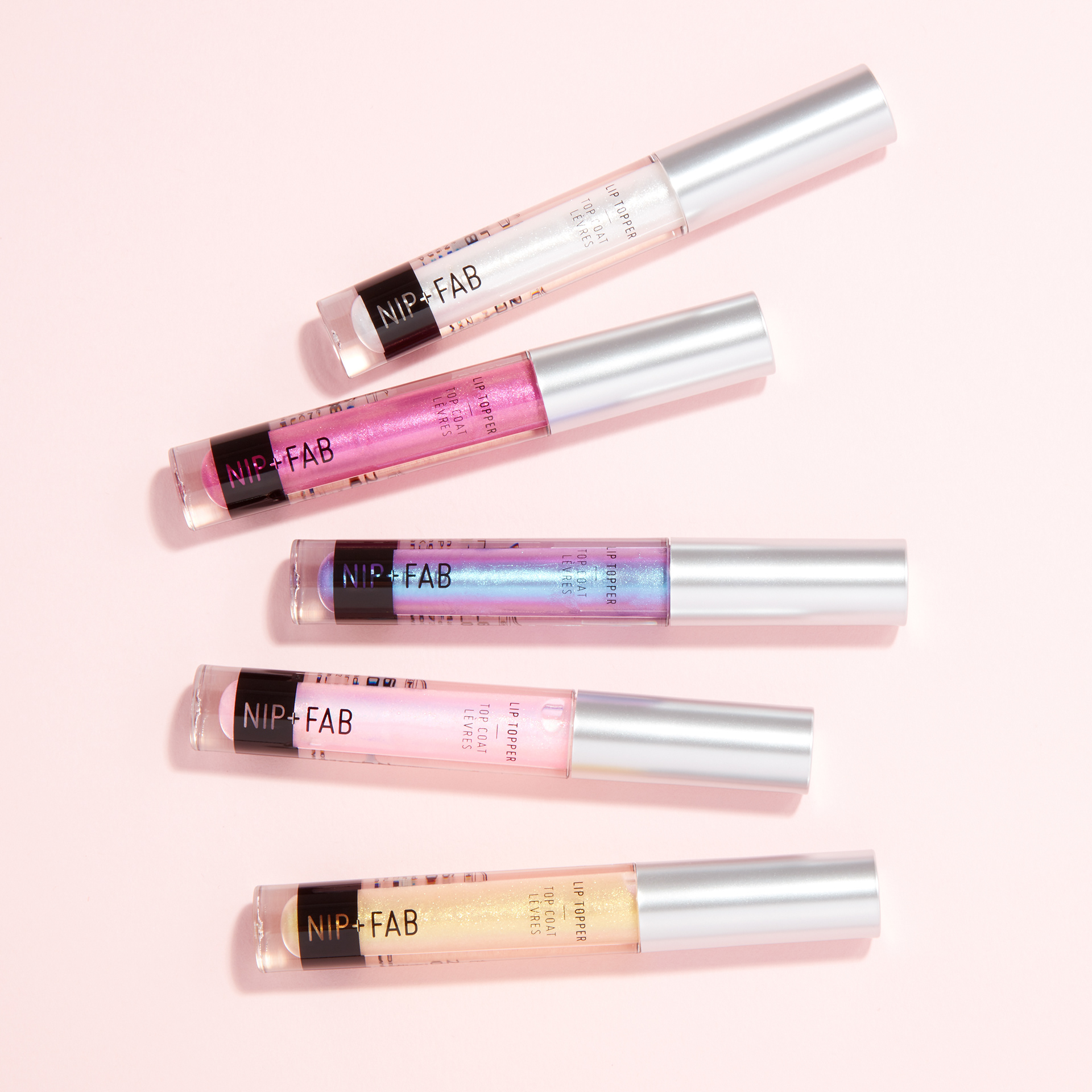
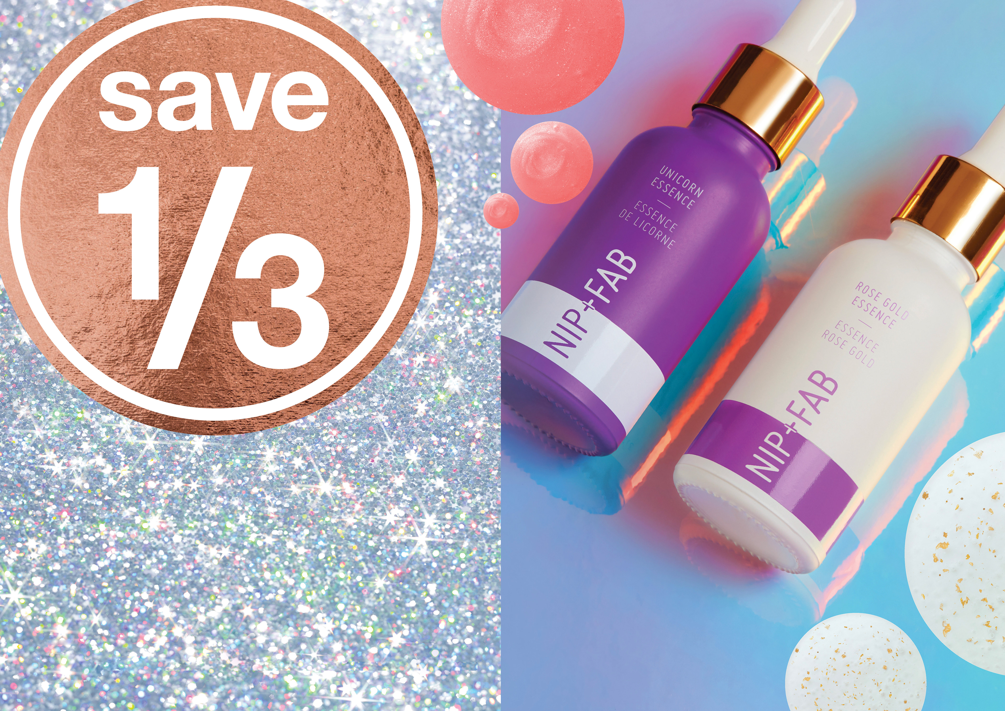
Glow fix go launch
This was an exciting new launch within Nip + Fab Makeup. The idea was to highlight the new holographic packaging, innovative colour ways of the products, and to make sure it was a range that would really stand out within the brand and alongside other competitors. These images would be used on. a 360 campaign to launch the range, across social media, events, online and in stores across marketing material and point of sale. I liaised with the sales and product development teams and worked alongside an external agency of stylists, photographers, and retouchers, reporting to the creative director.
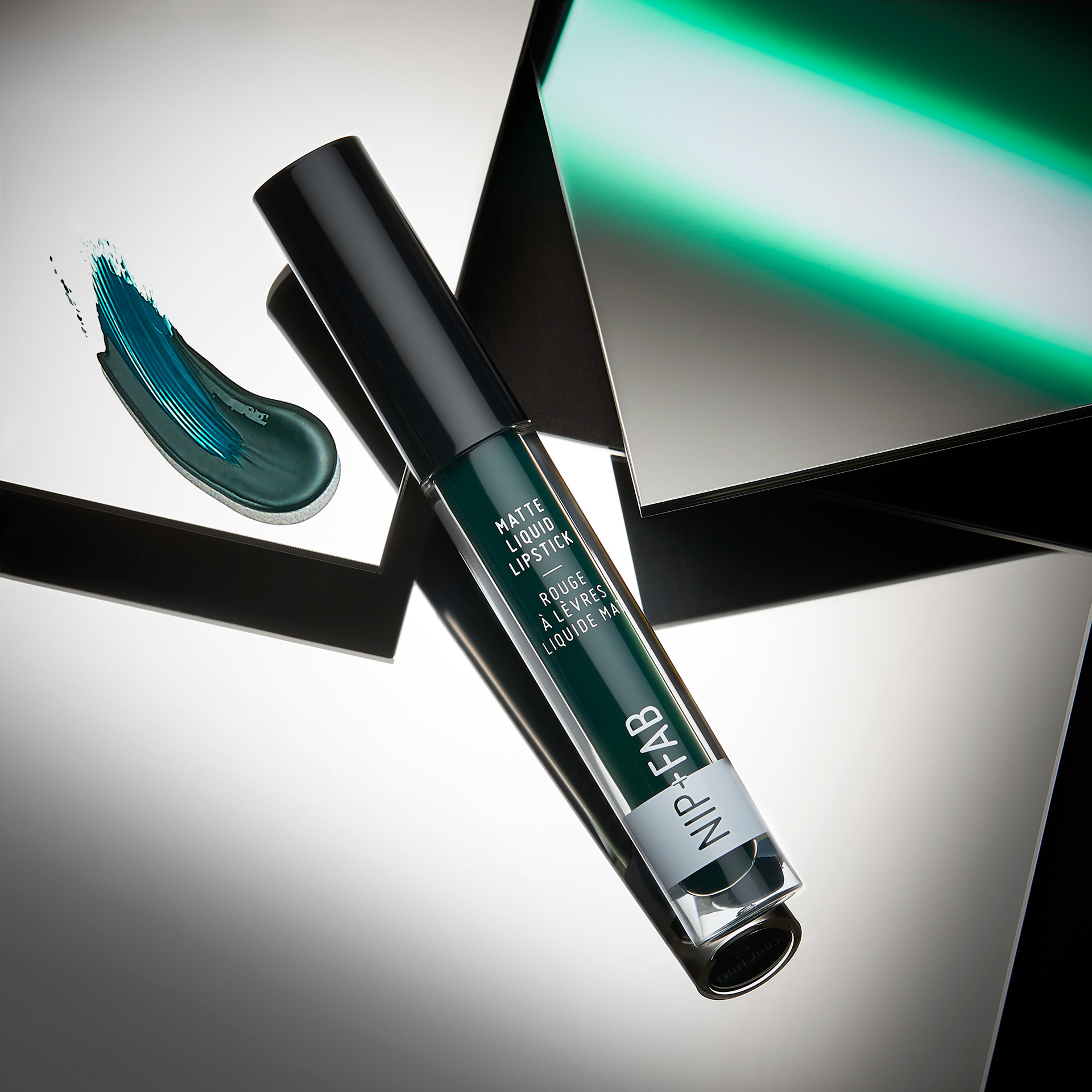
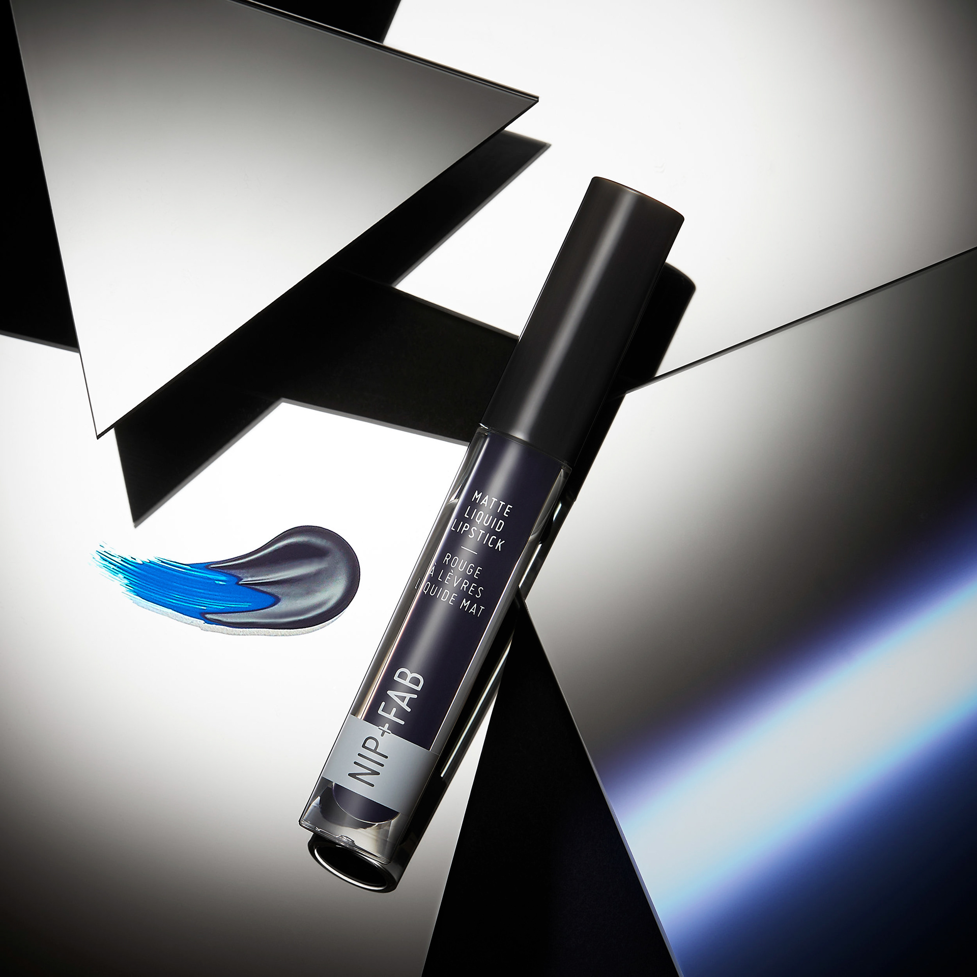
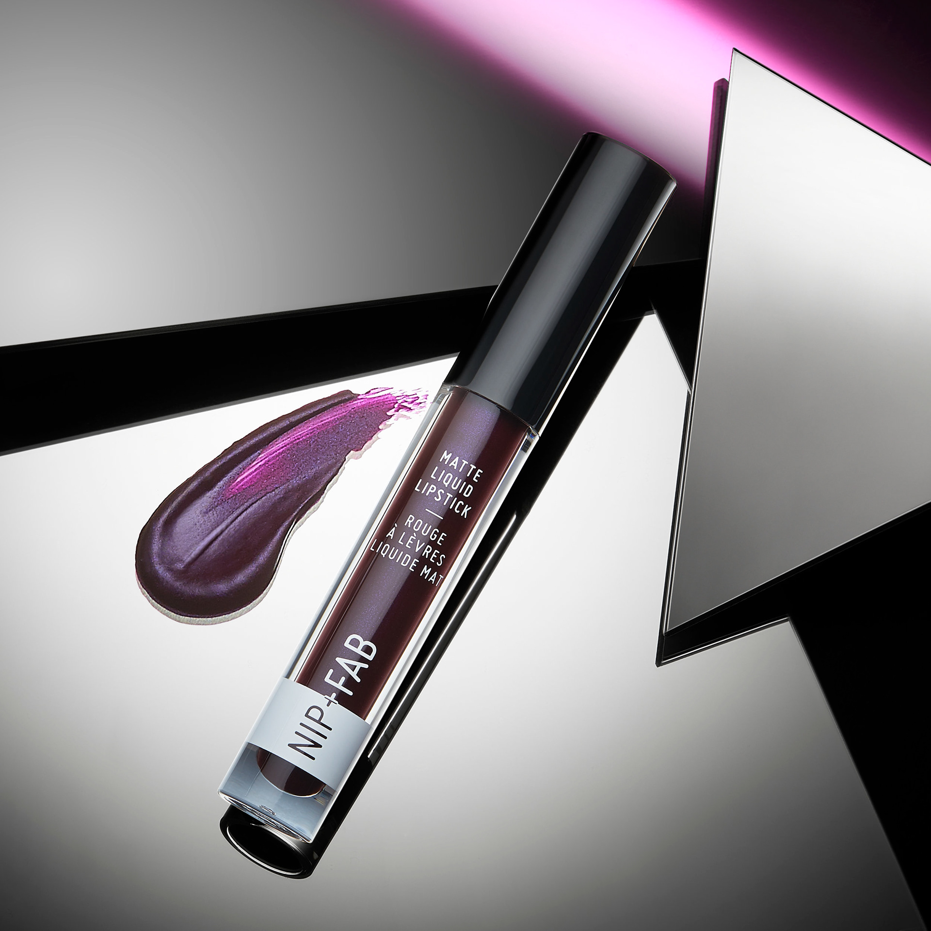
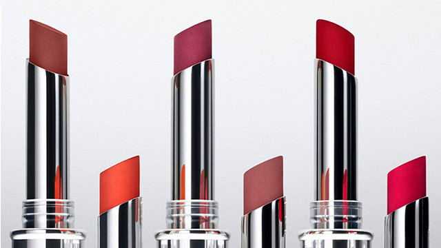
after hours liquid lipstick creative
These were visuals that I concepted and directed for an autumnal launch. I wanted to show the pigmented colours and play with the 'after hours' theme and created an edgier story for this launch.
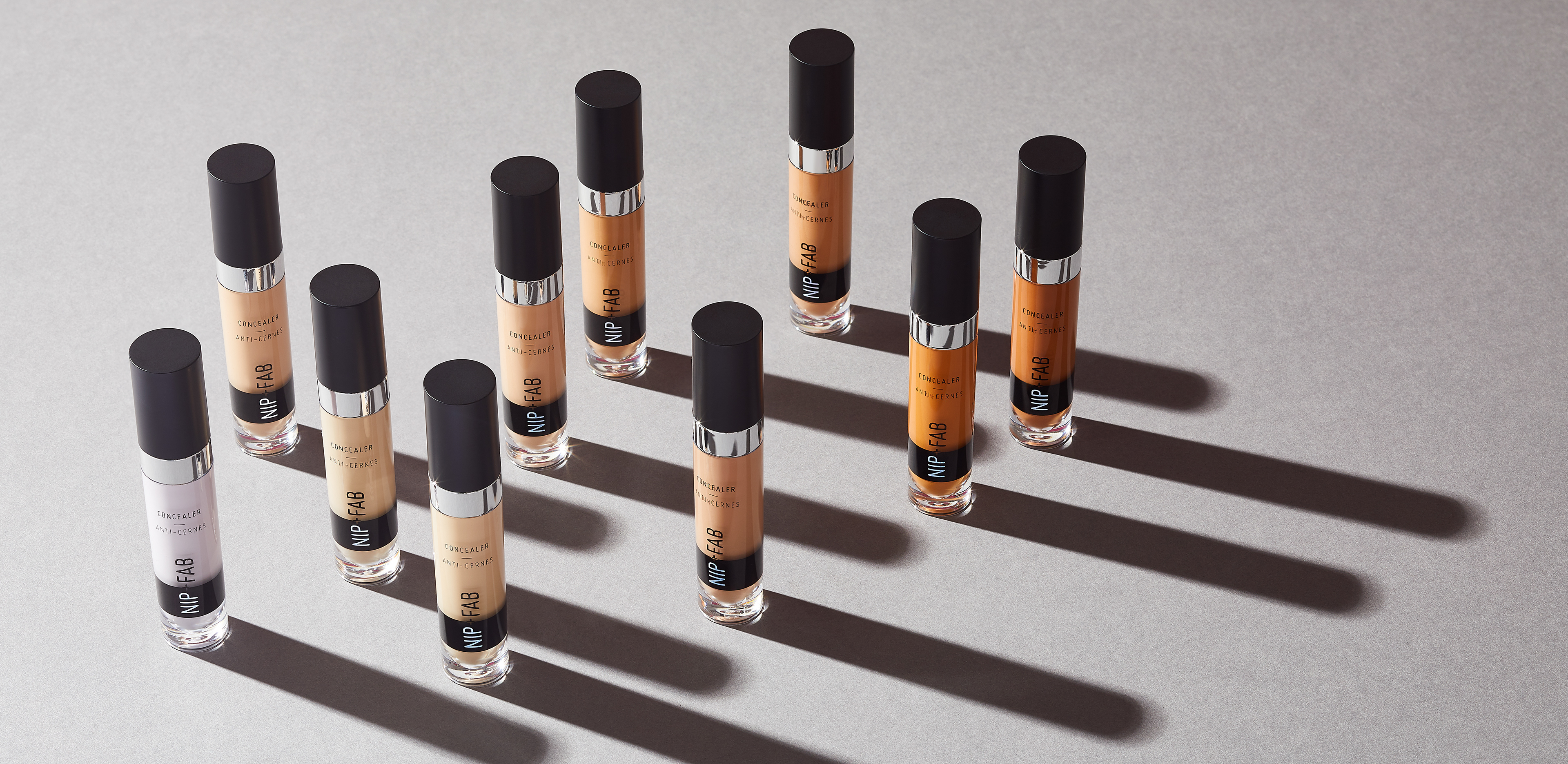
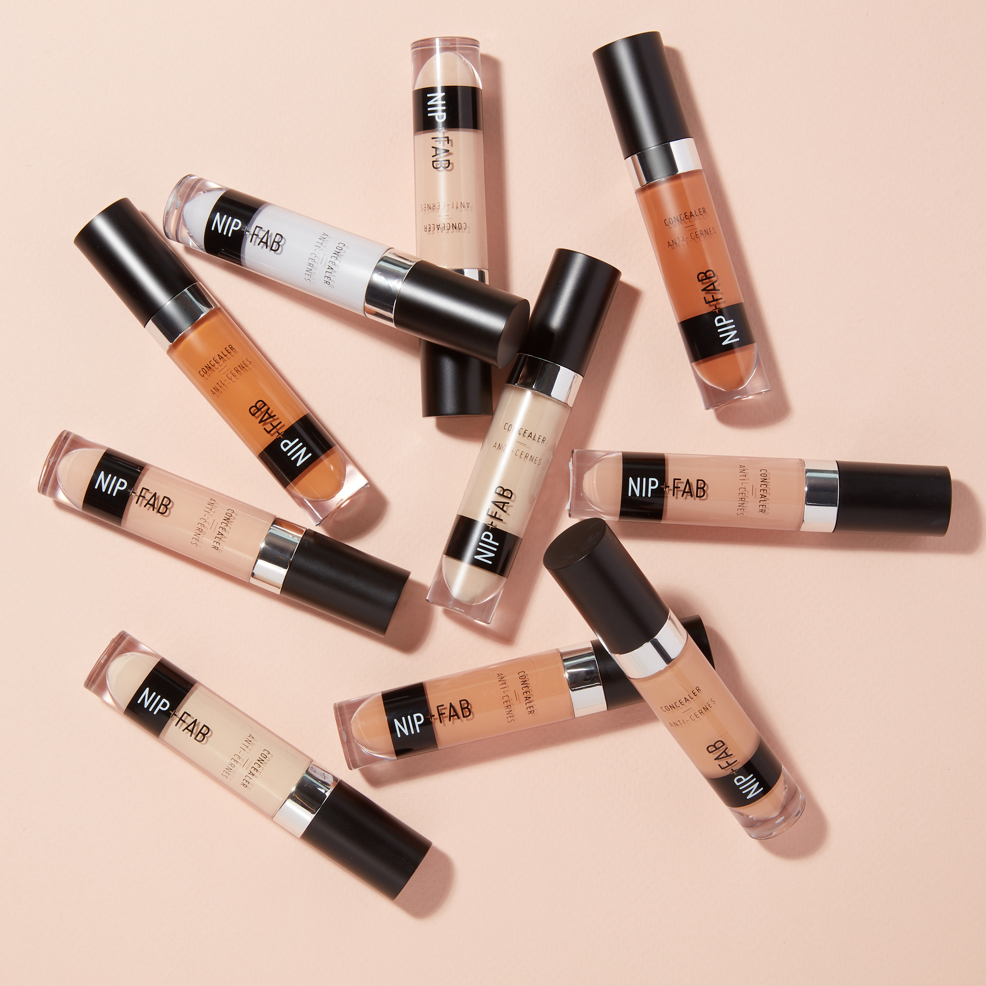
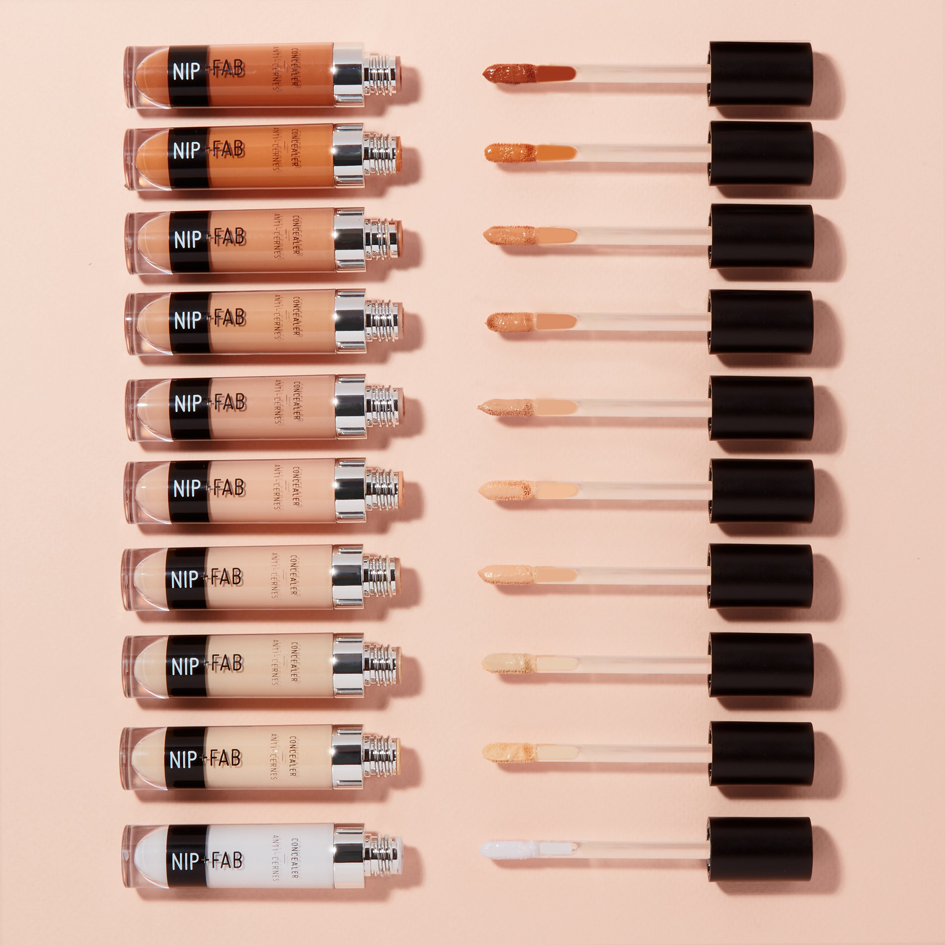
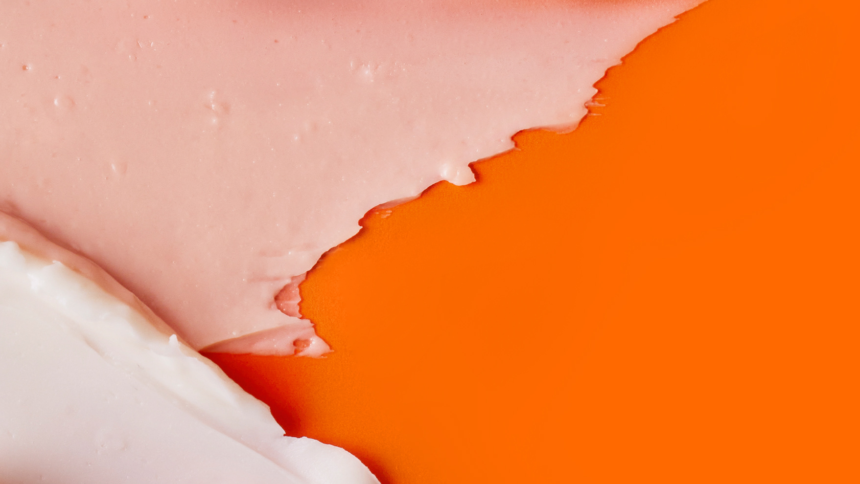
concealers social media creative imagery
This was a still life shoot created to support the launch of these concealers across all social platforms and for digital use. It was important to show the shade range as well as elevate the products to a more premium look and feel.
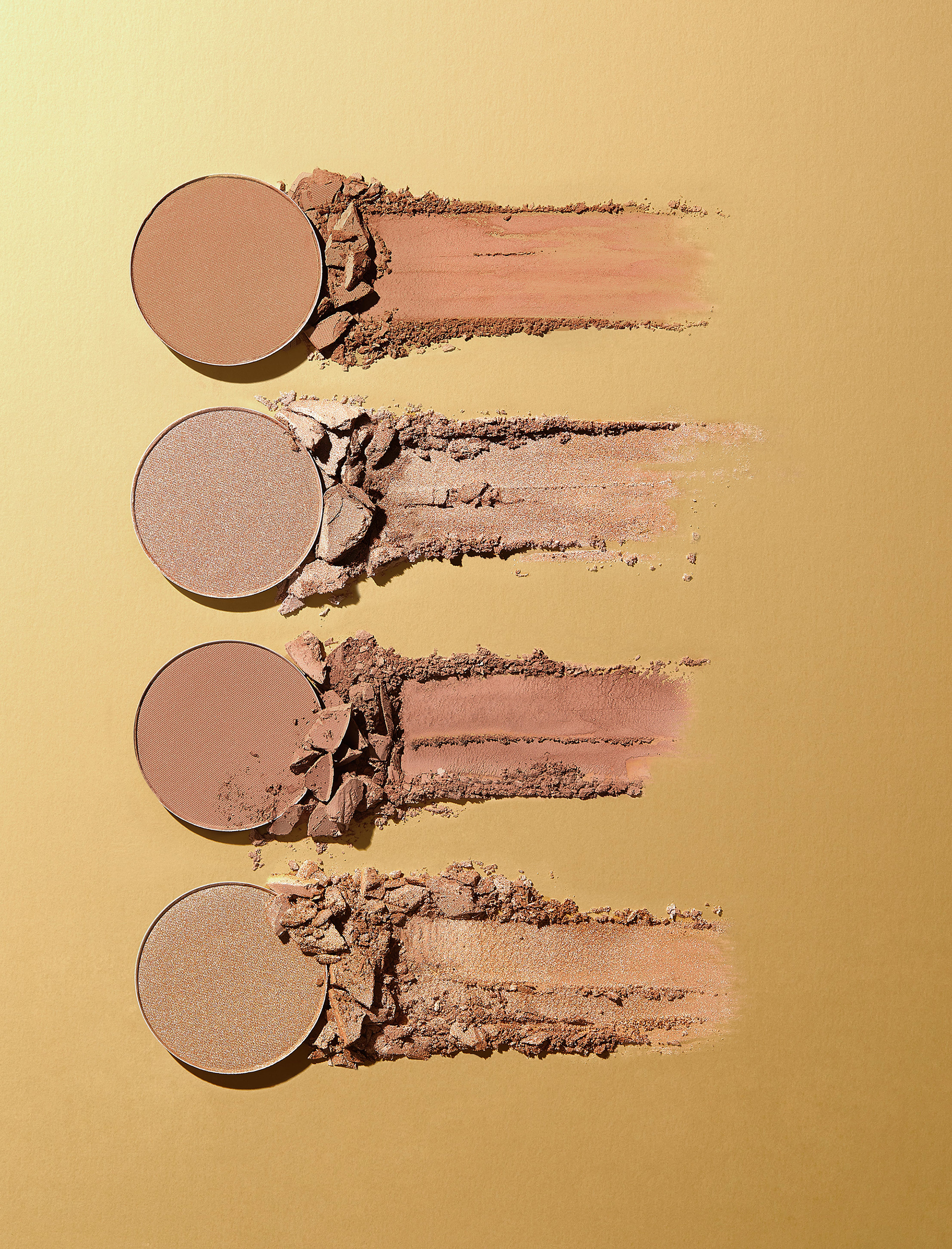
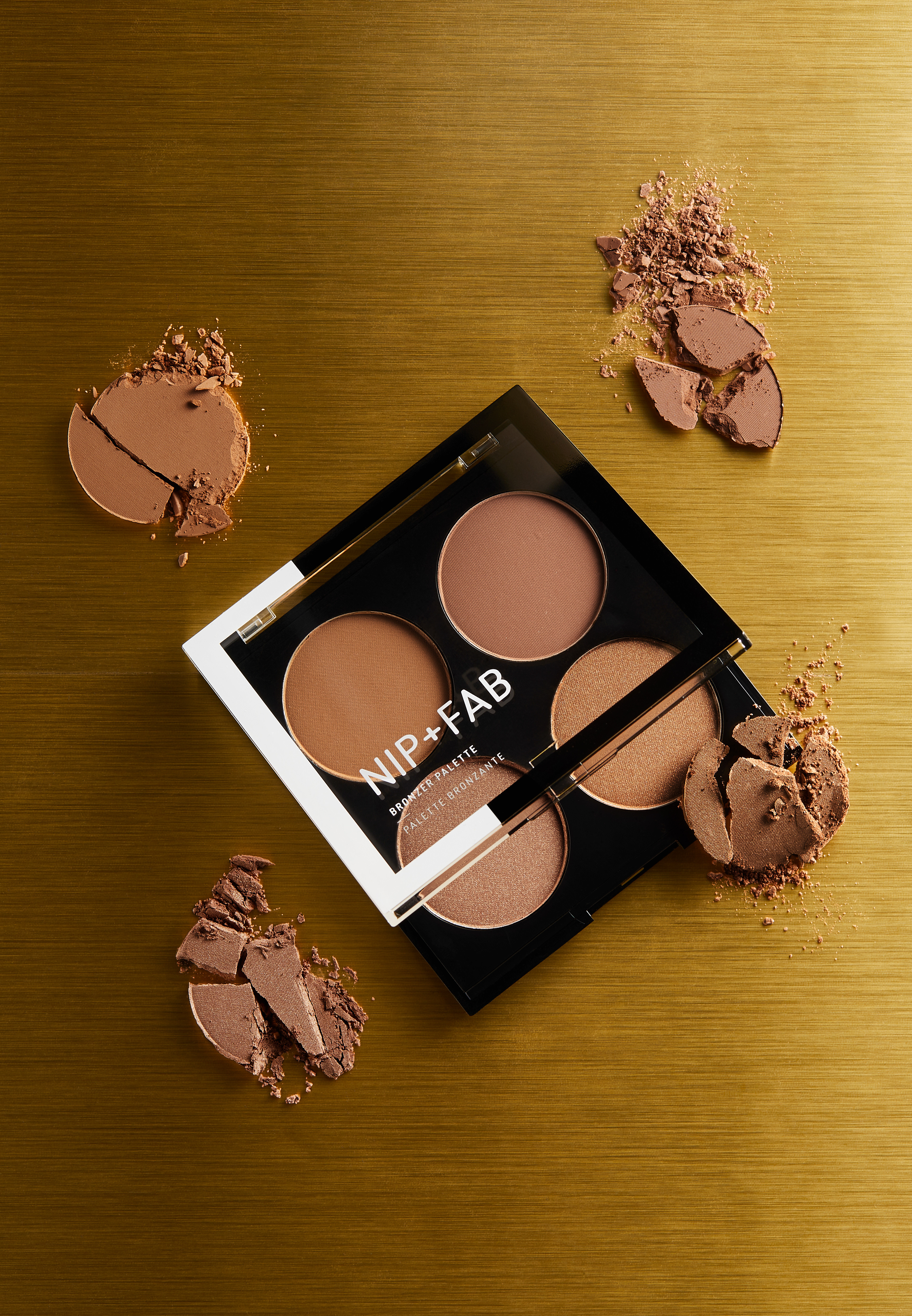
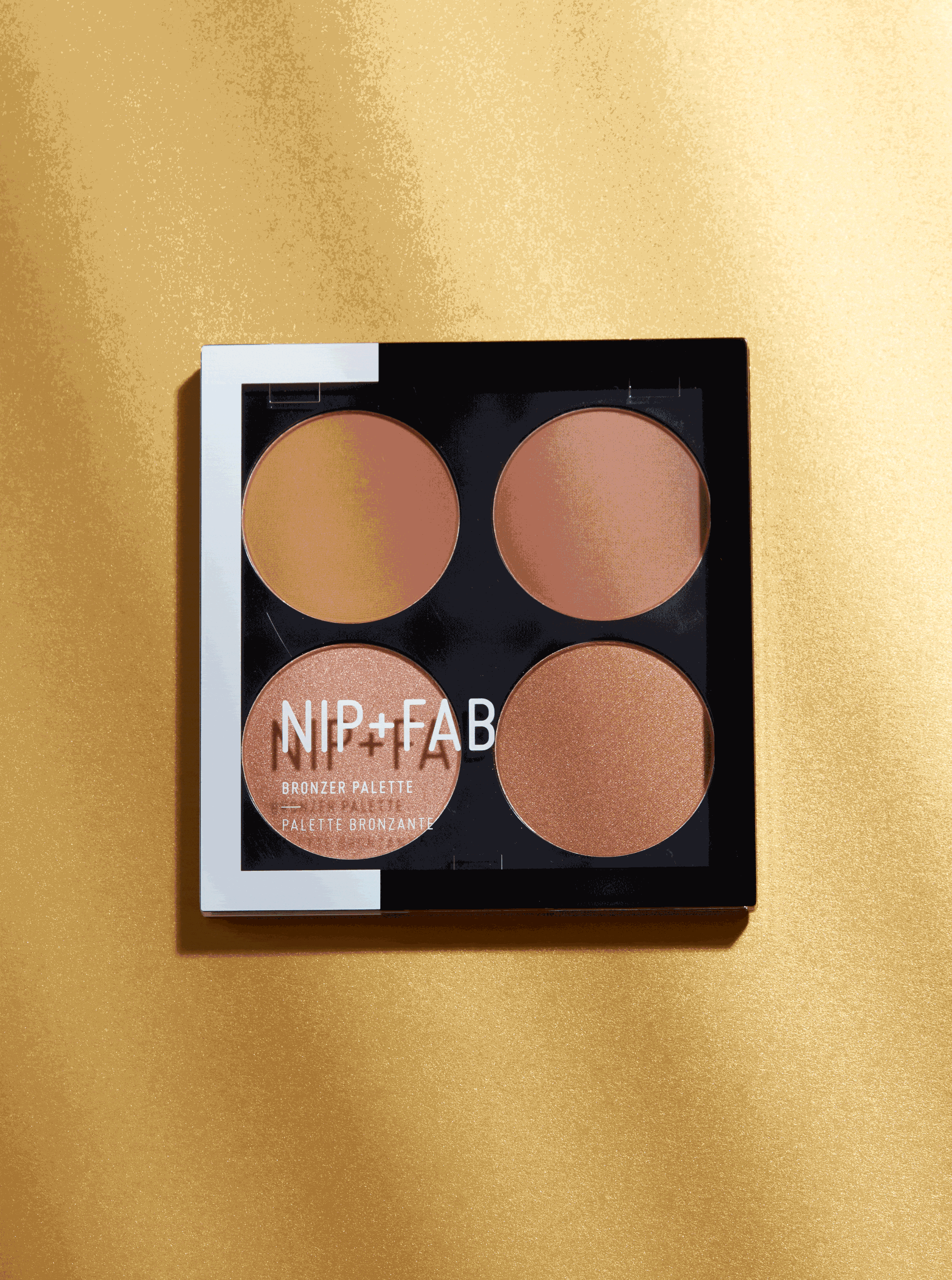
Bronzer collection
Kicking off the summer season with the launch of a new bronzer palette, I created a shoot to support the launch and inject a summer vibe to the social grid. It was important to show textures, warmth and product variety with this story, and get our customers ready for their holidays.
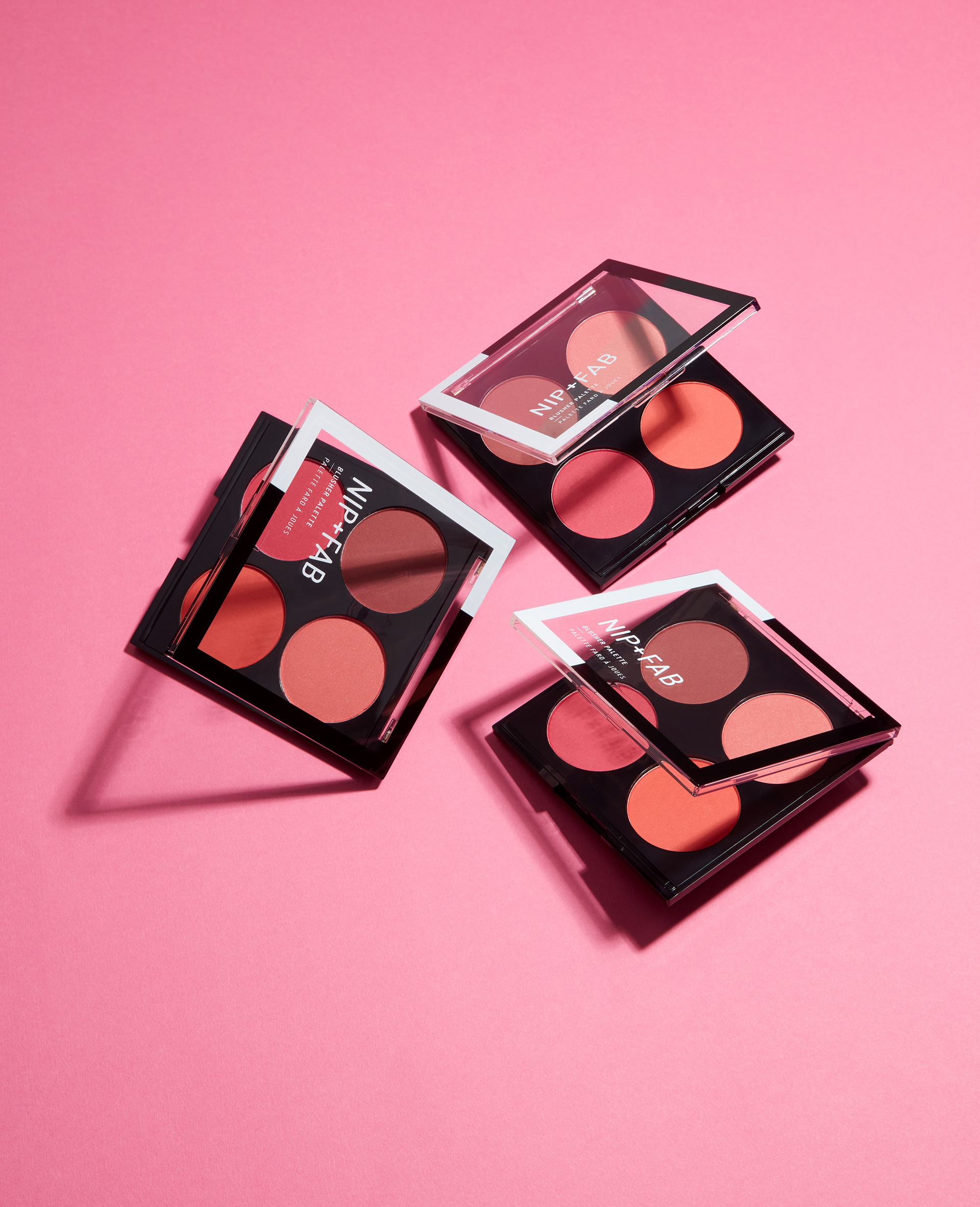
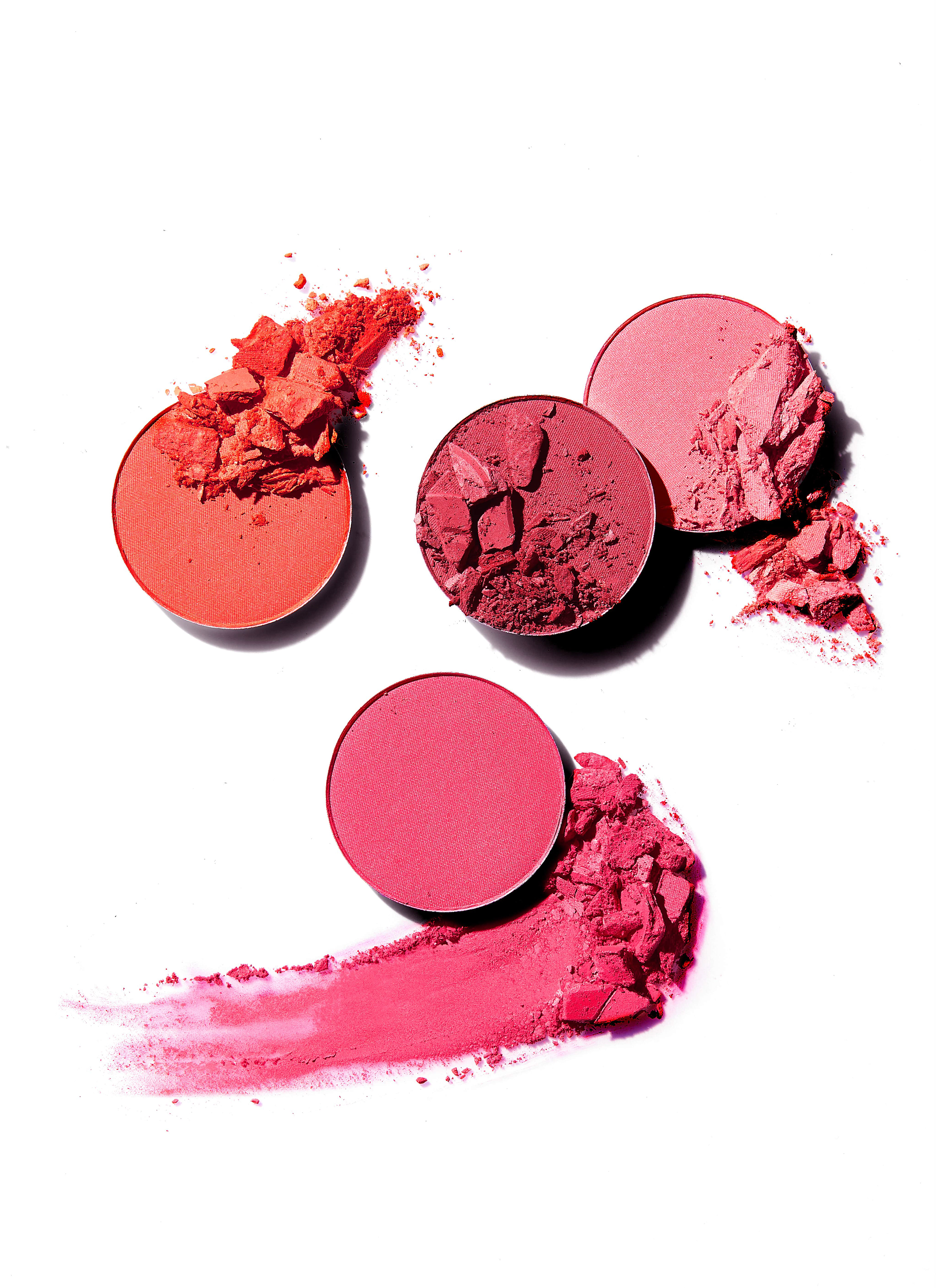
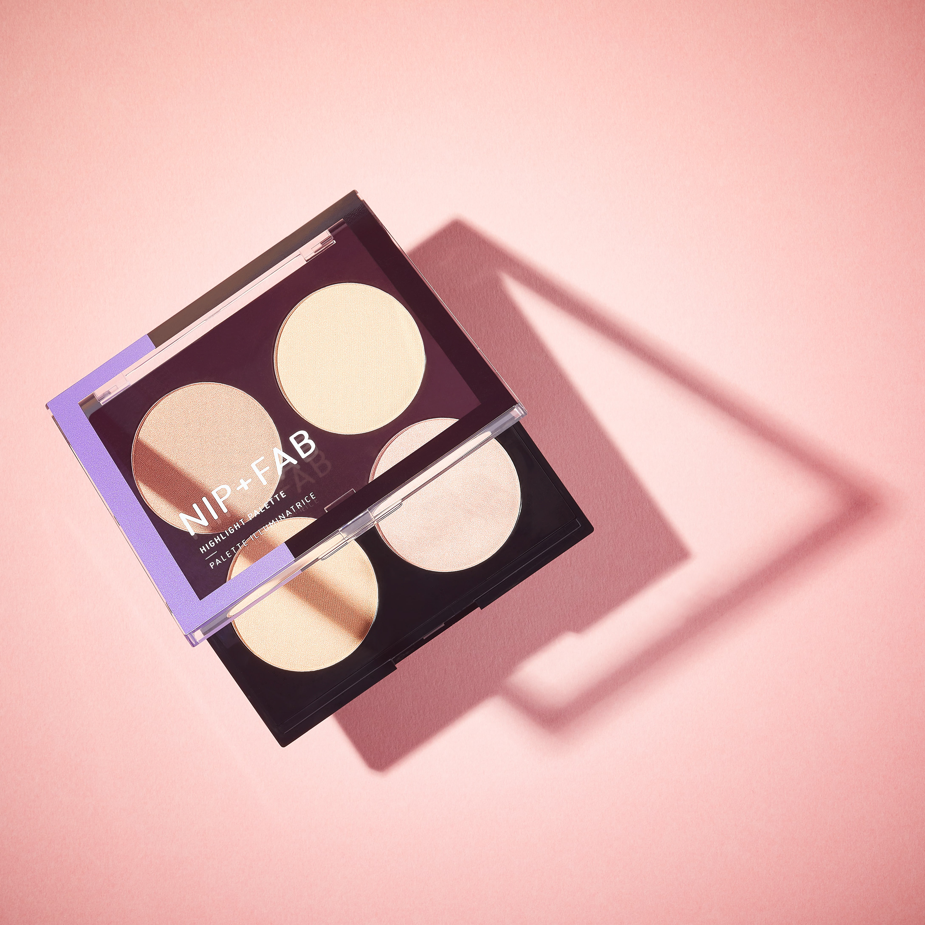
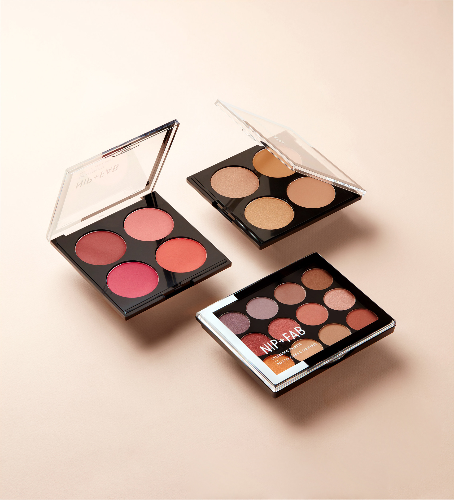
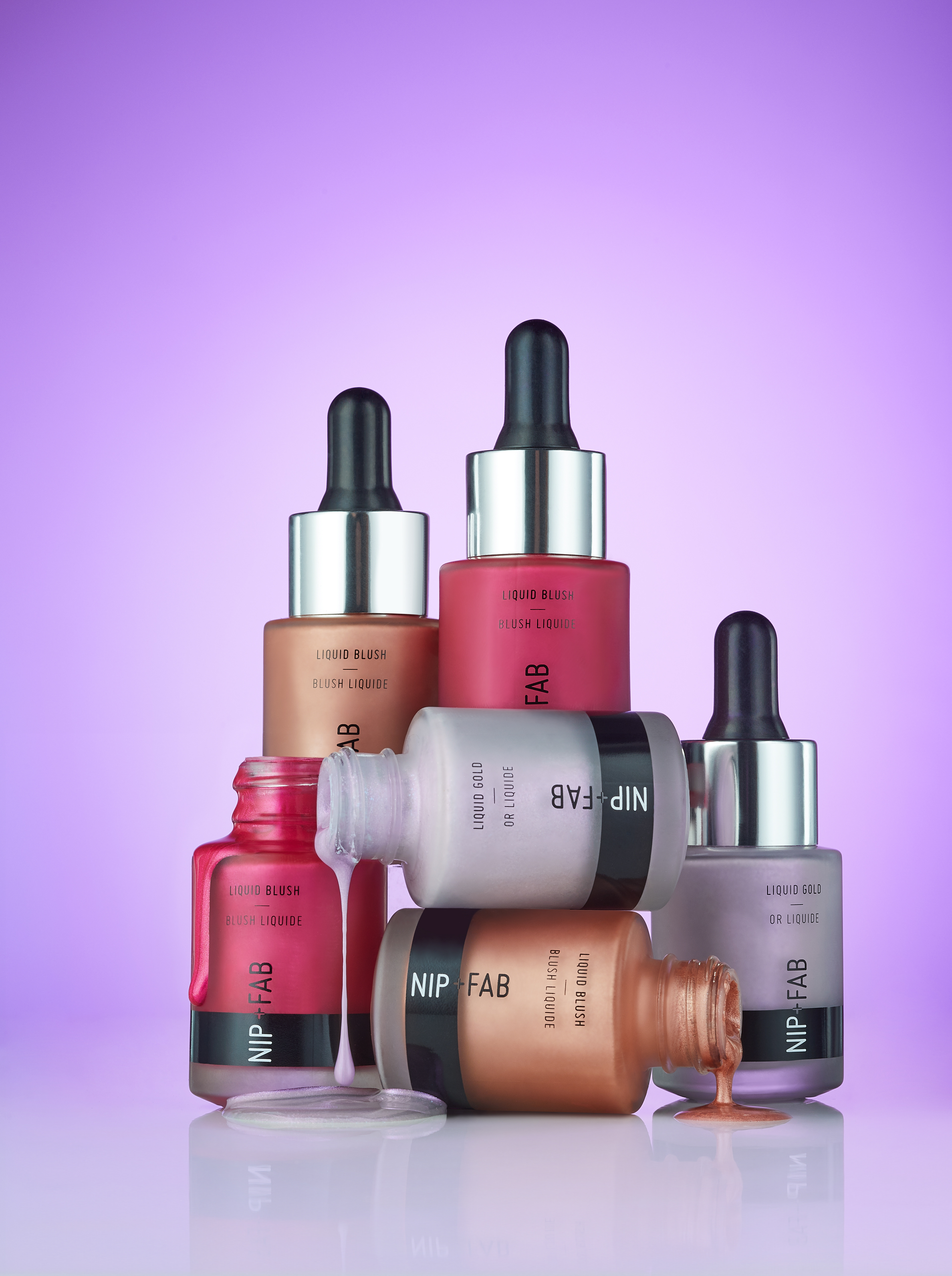
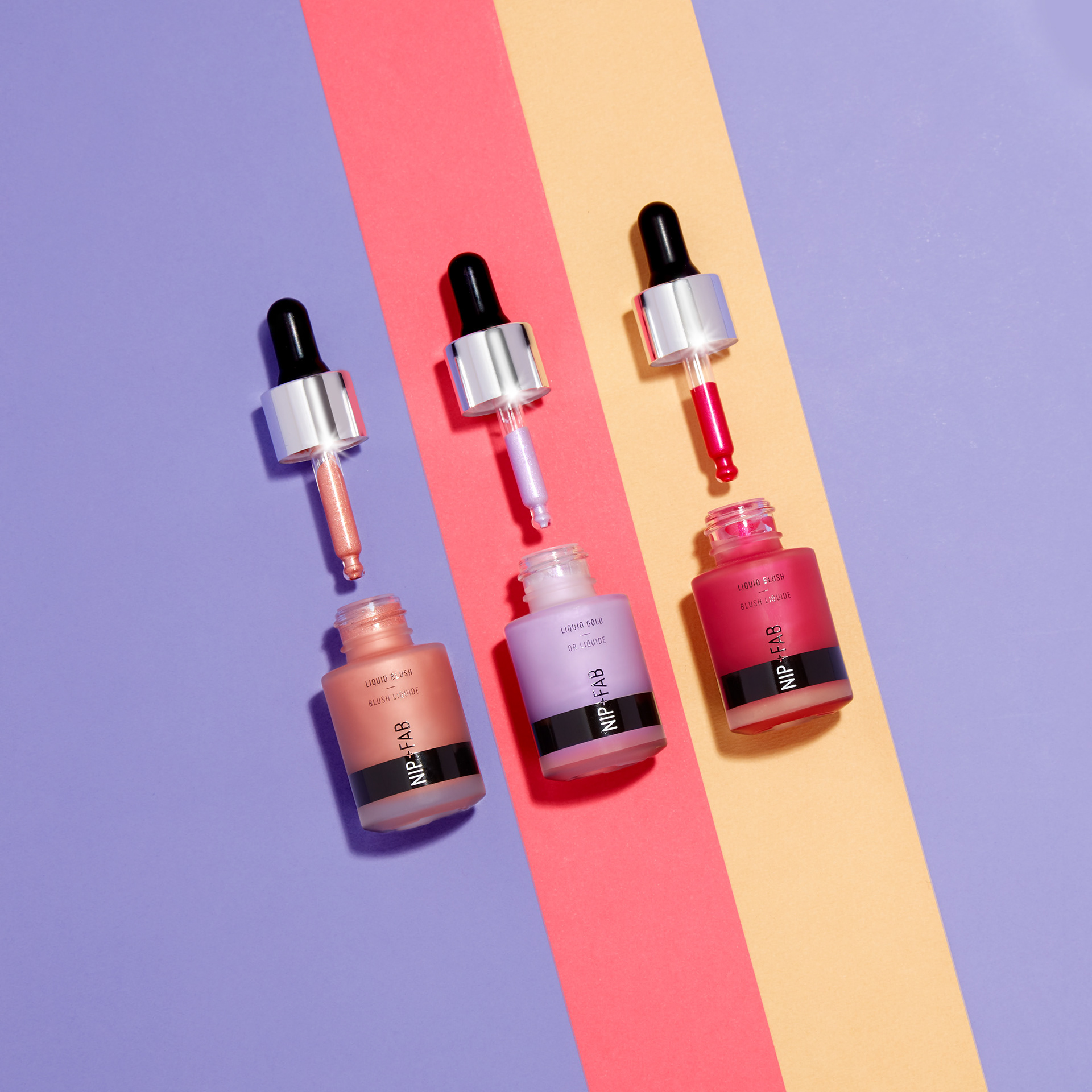
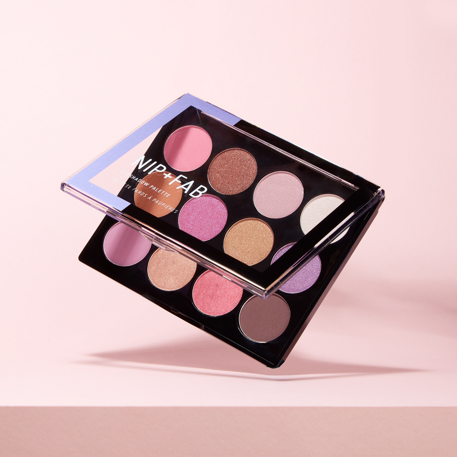
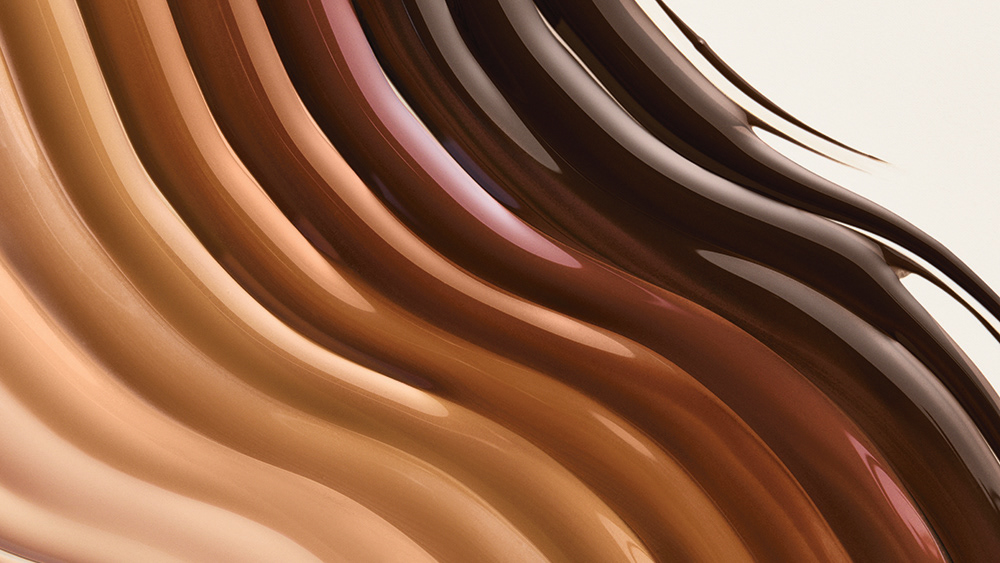
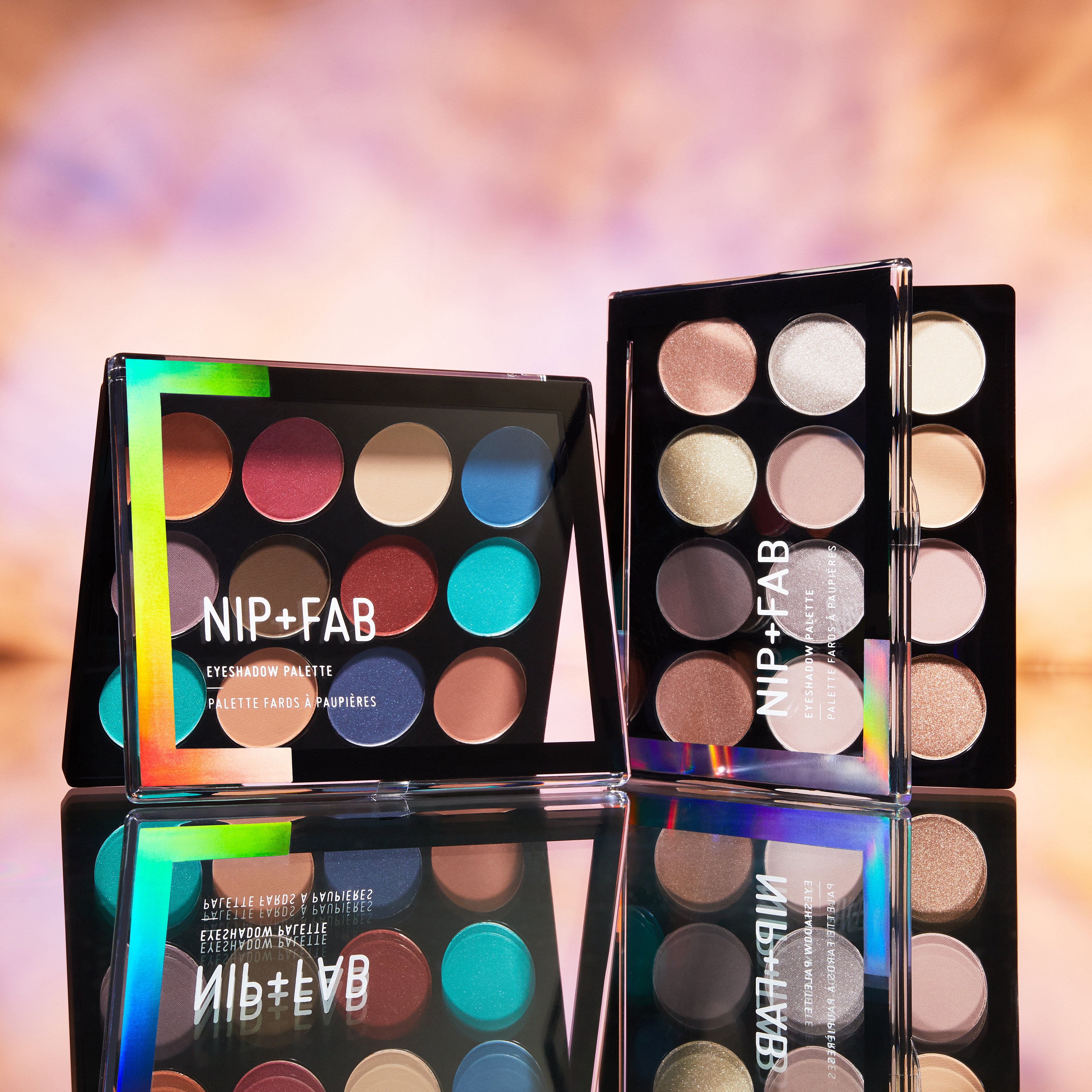
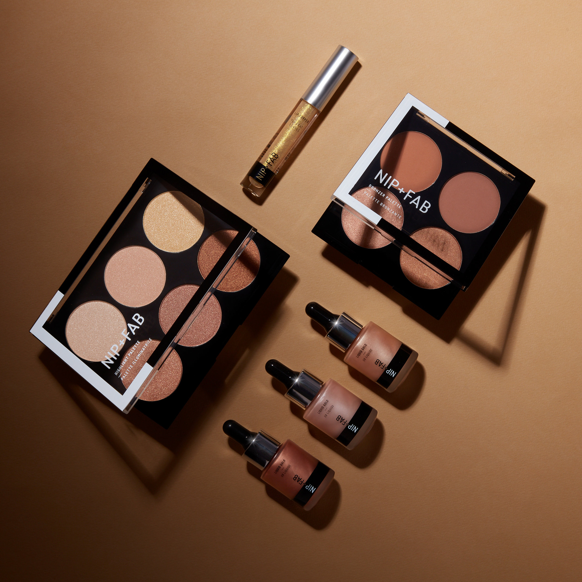
The colour collections
The colour lines within the make up range were very innovative and vibrant, and it was the most important characteristic to show in this photoshoot. With the use of lighting, textures and colour, I created bold social imagery to help stand out in the market.
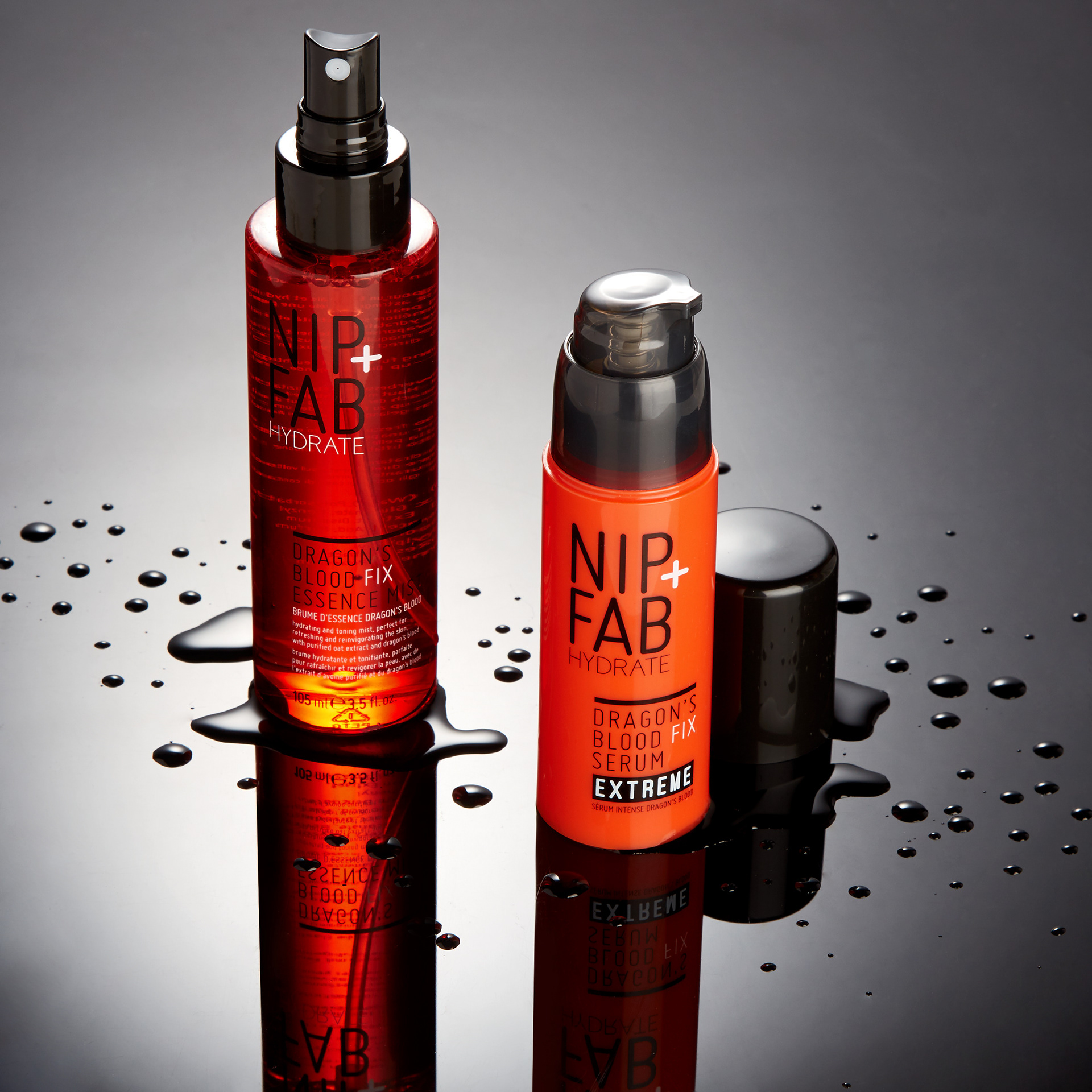
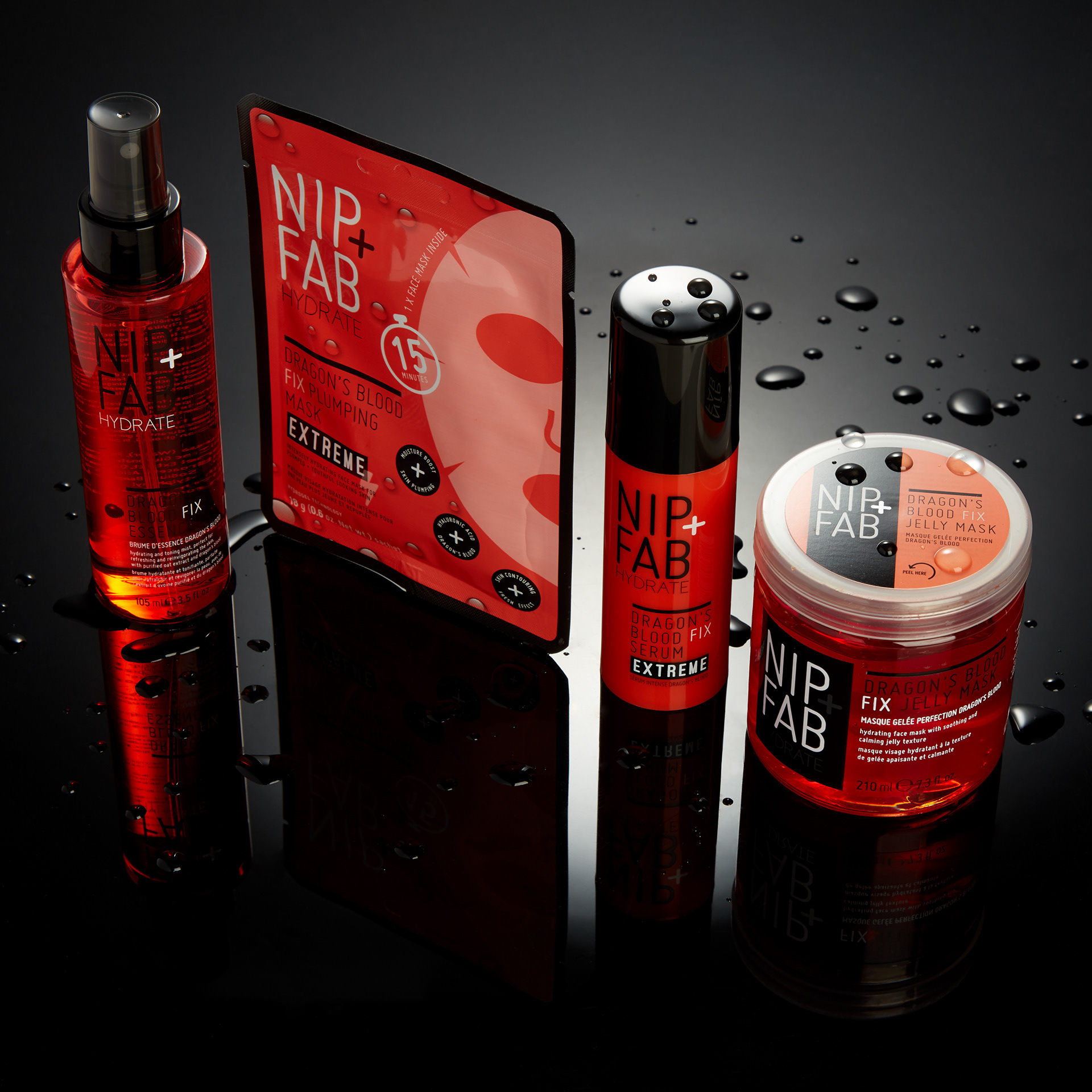
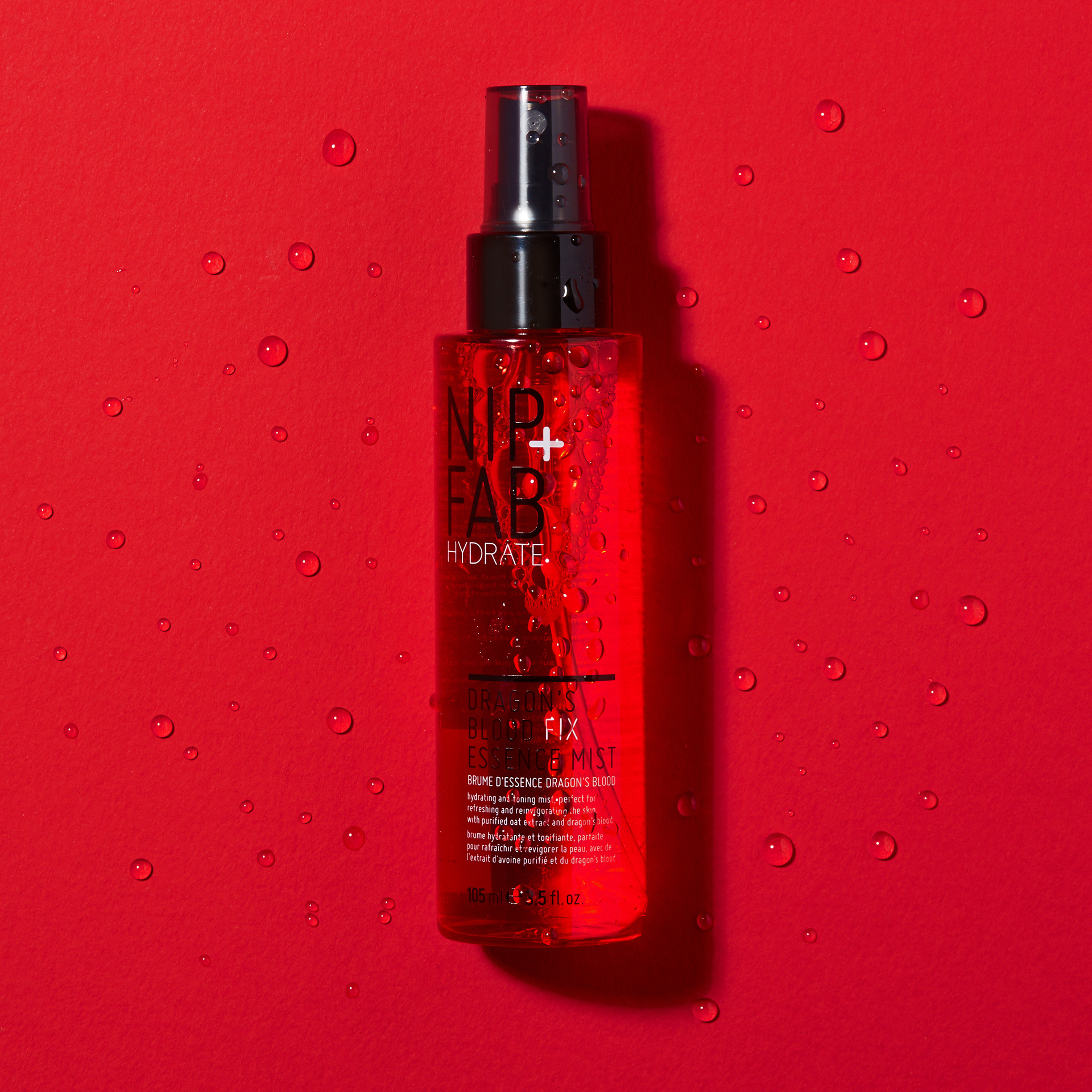
dragon's blood extreme range
It was important to portray intense hydration with this shoot. This range already has a cult following, so I created something impactful and different from the usual colourful Nip+Fab visuals without compromising the brand identity.
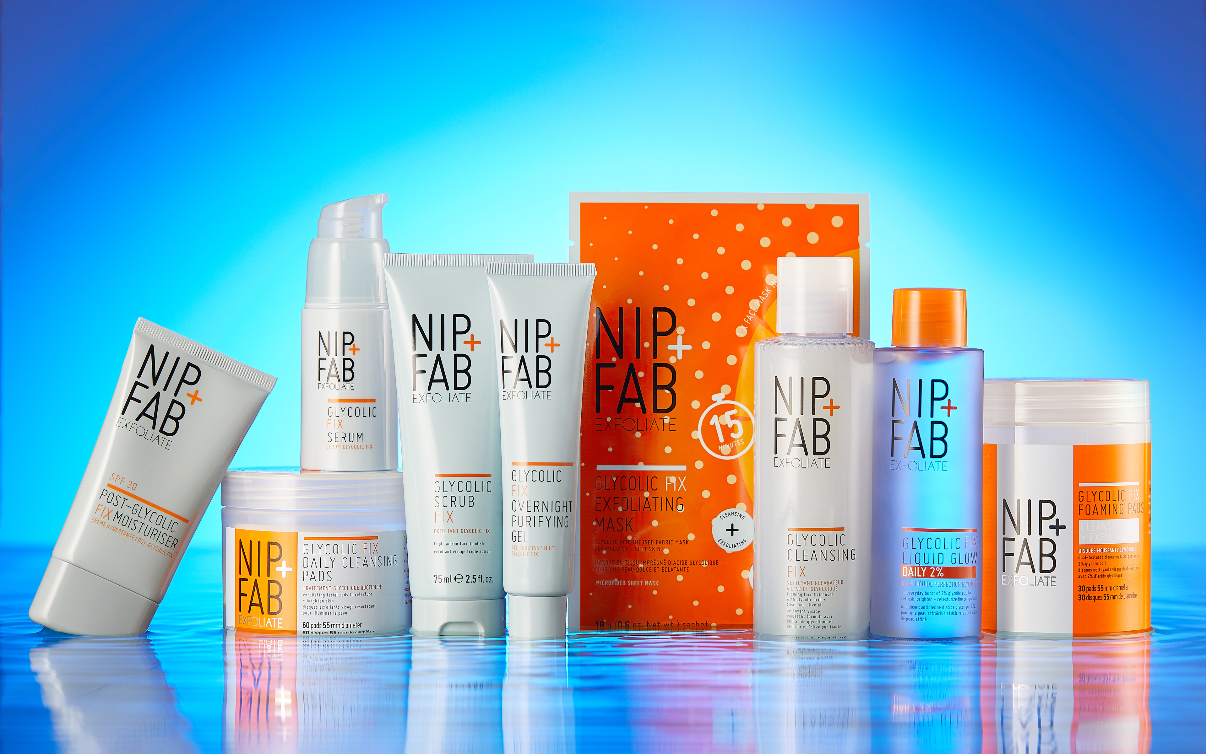
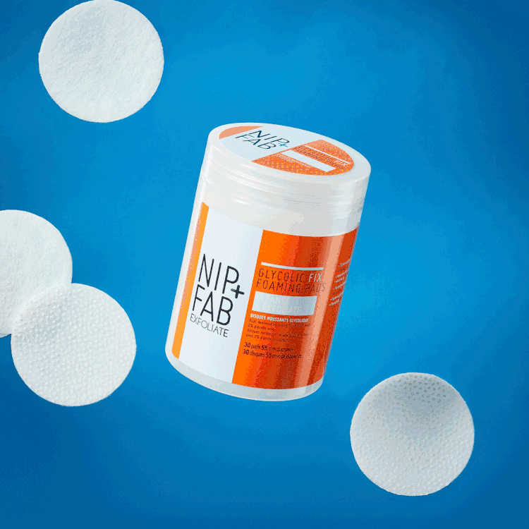
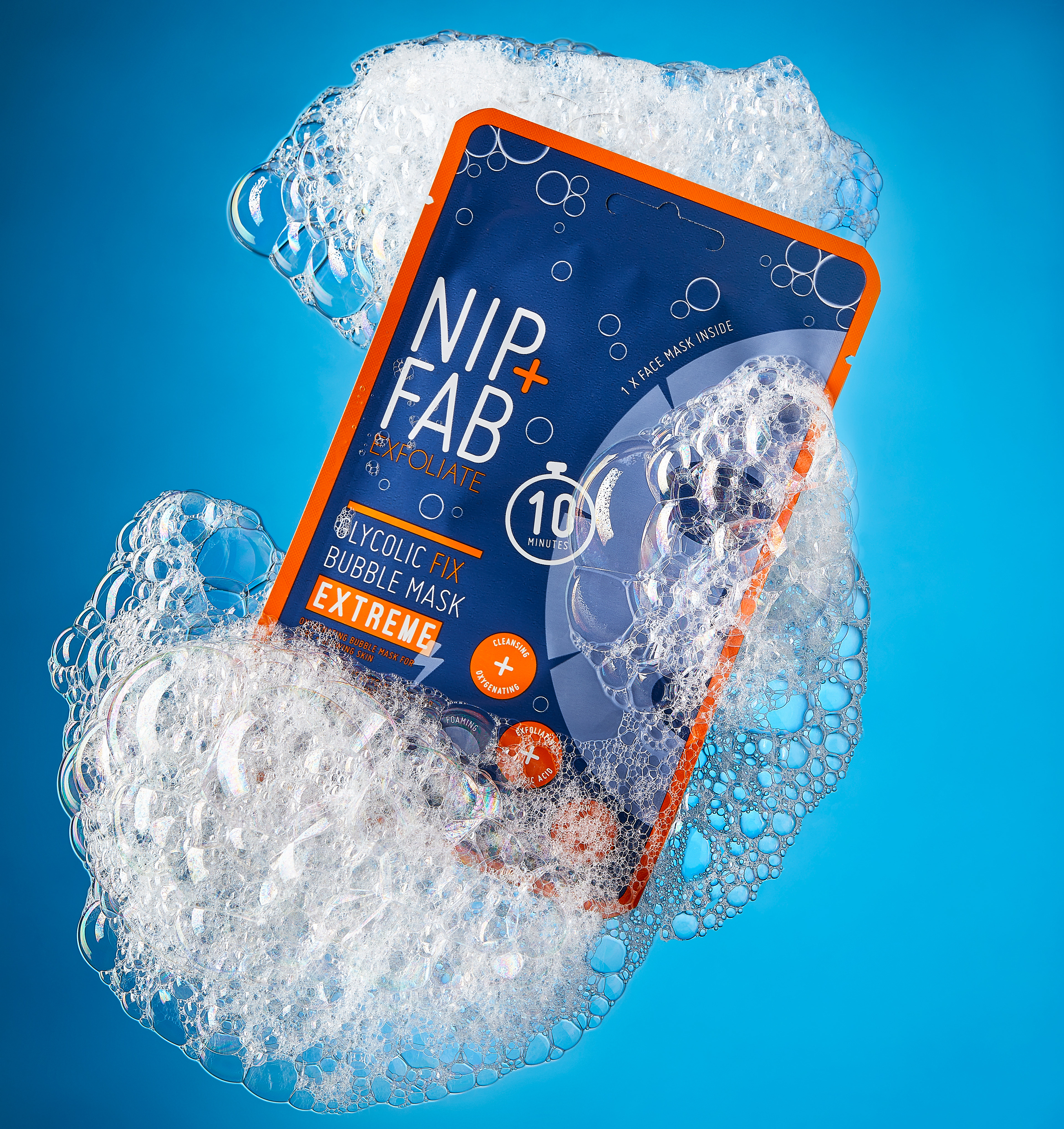
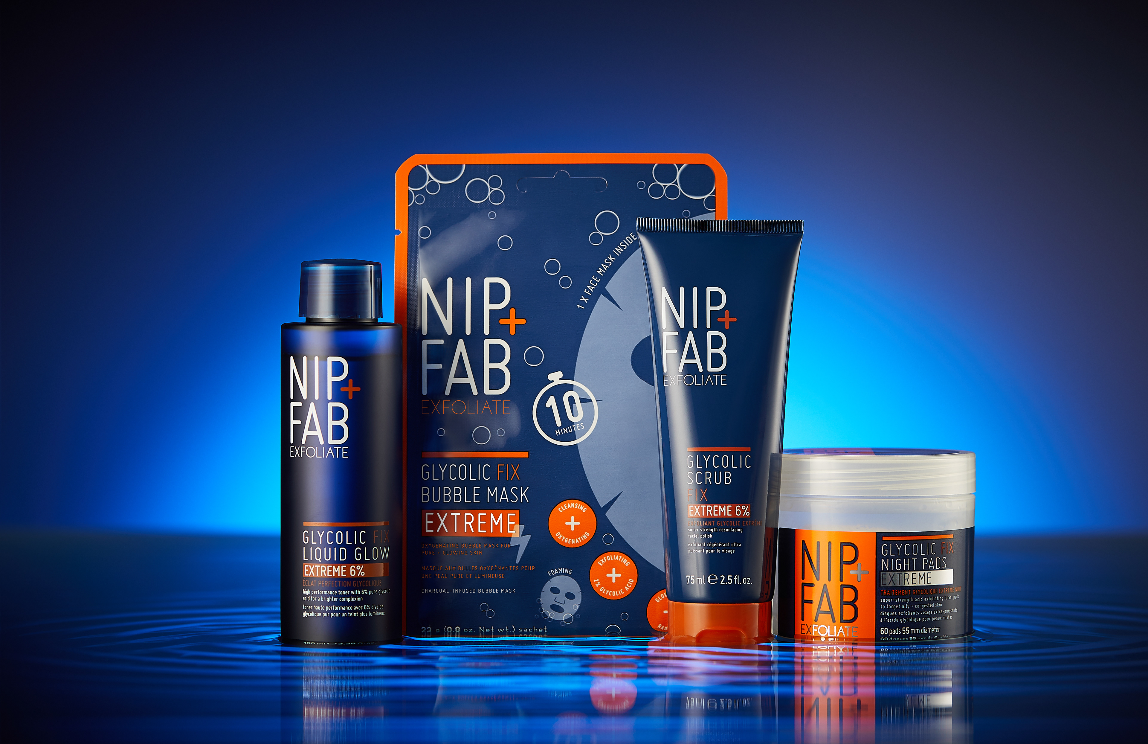
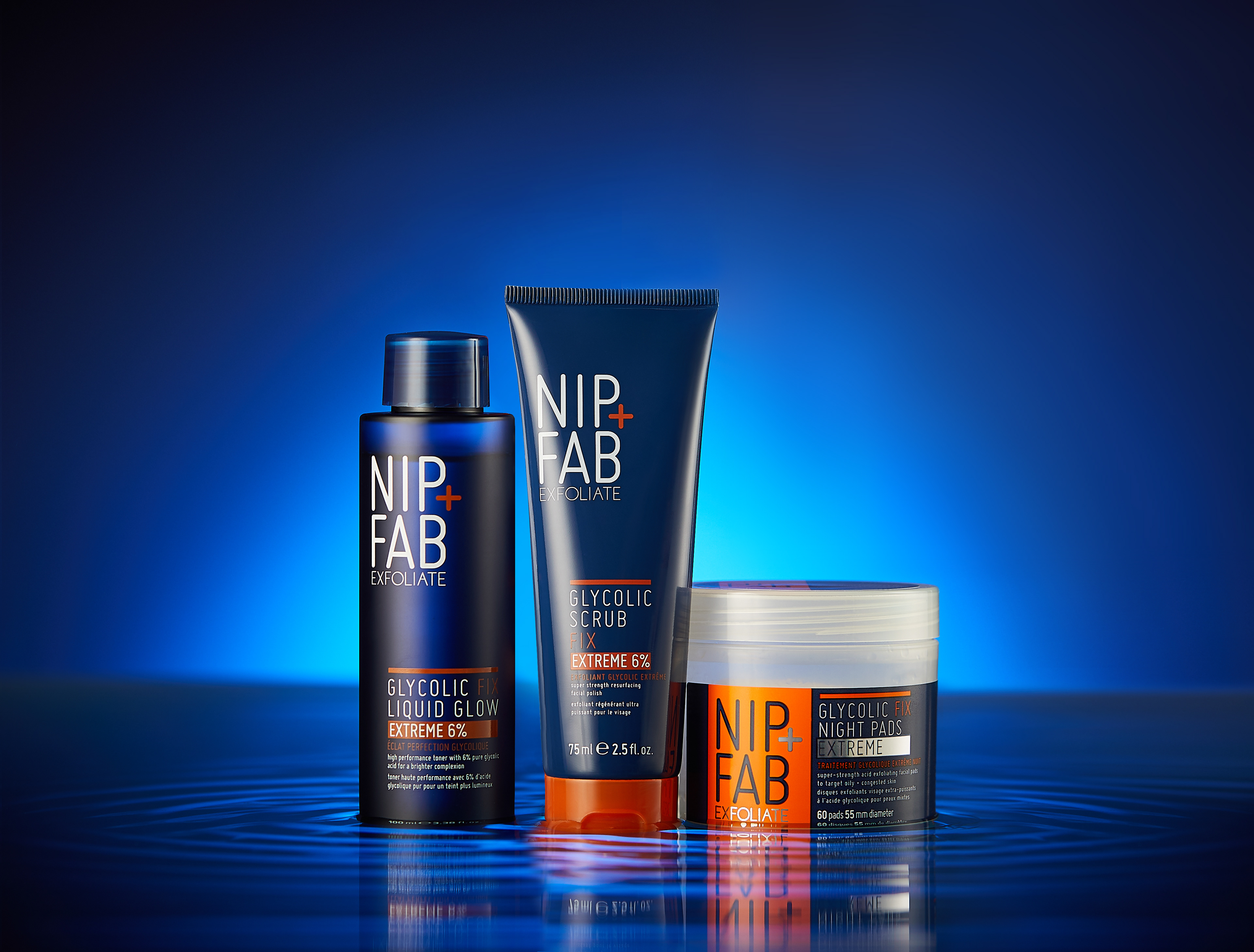
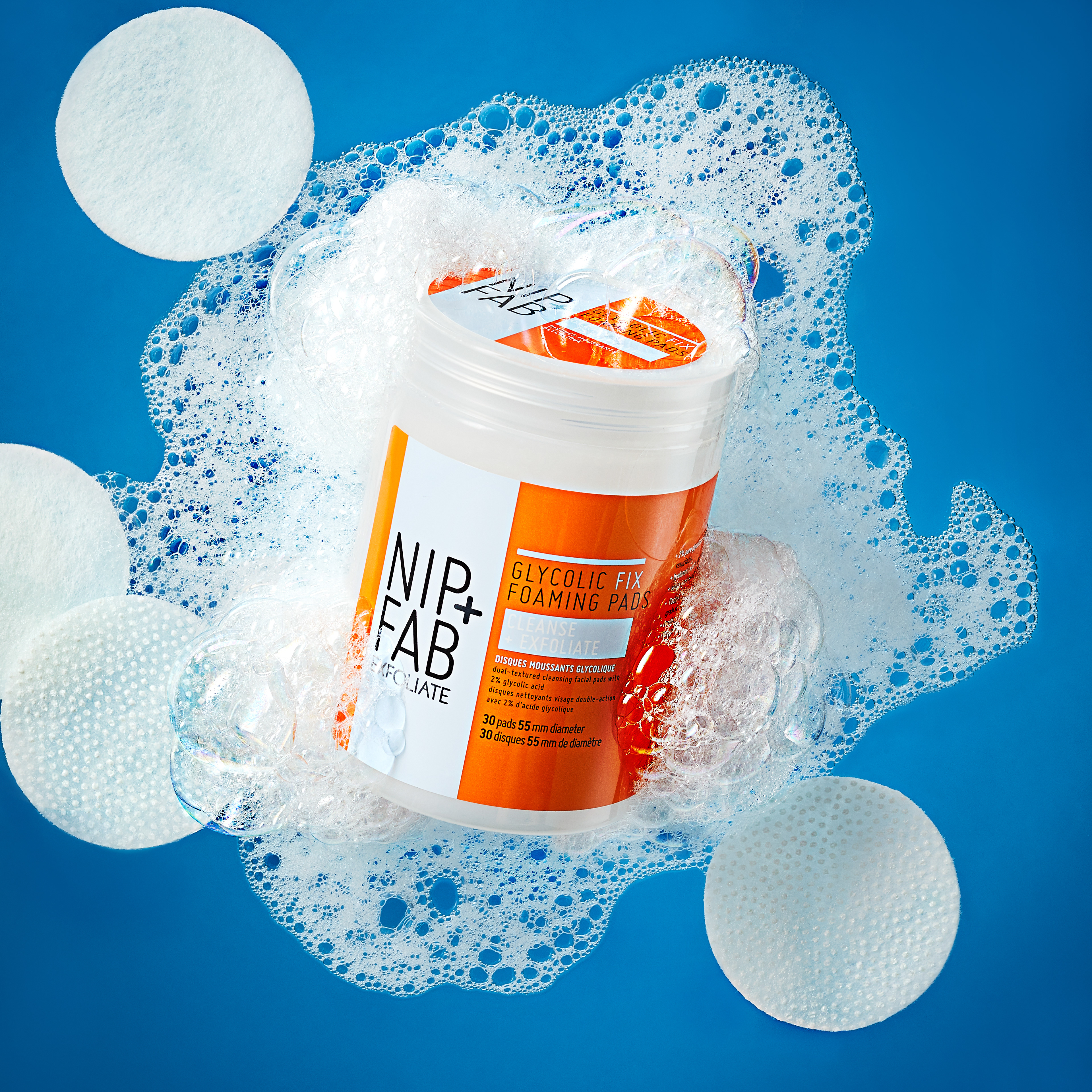
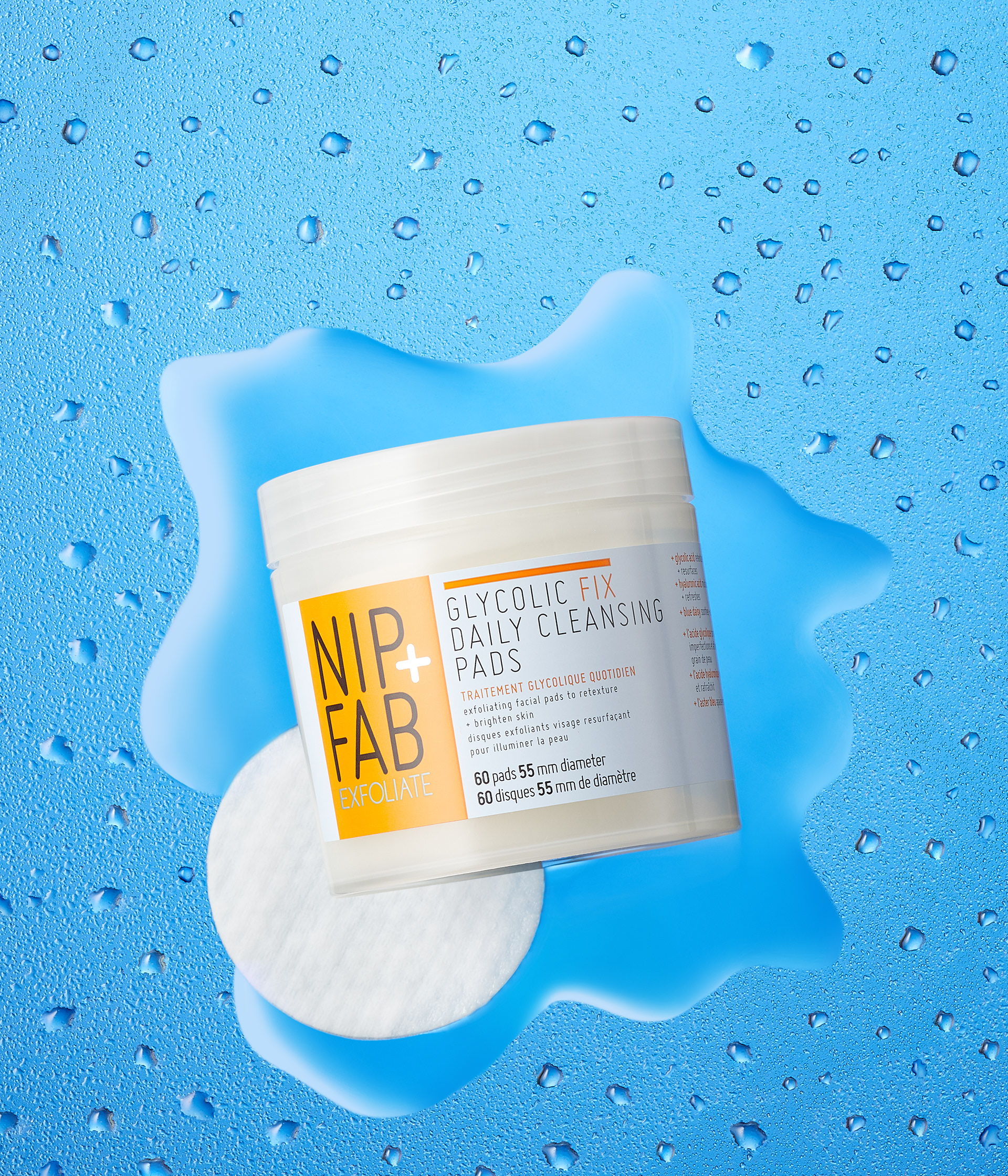
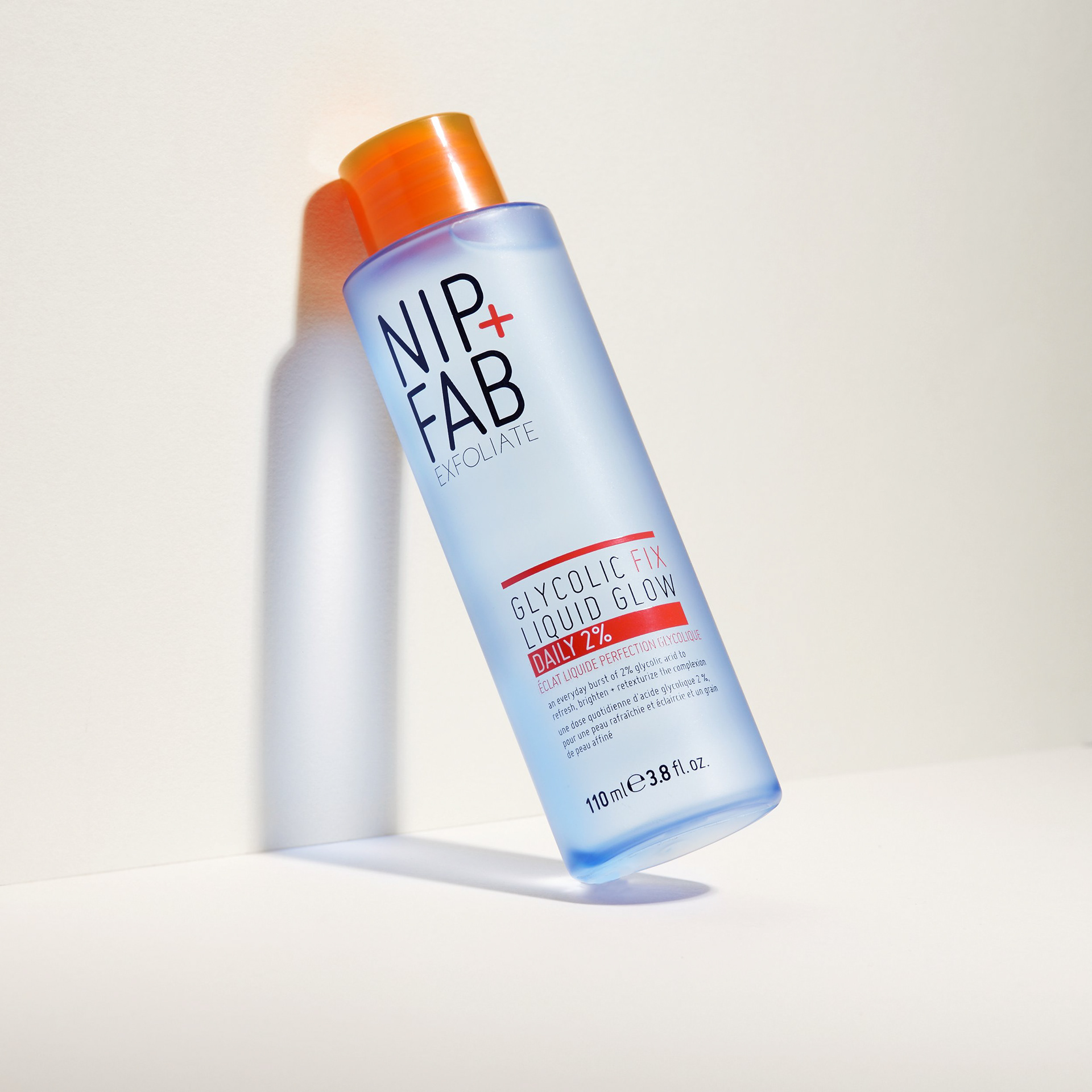
Glycolic fix hero campaign art direction
As a bestselling range, which was constantly being developed and added to, I had the opportunity to create and direct key hero visuals to be used for this range. These campaign images featured across all platforms, including social media, online and for national and international retailers in store and on their websites.
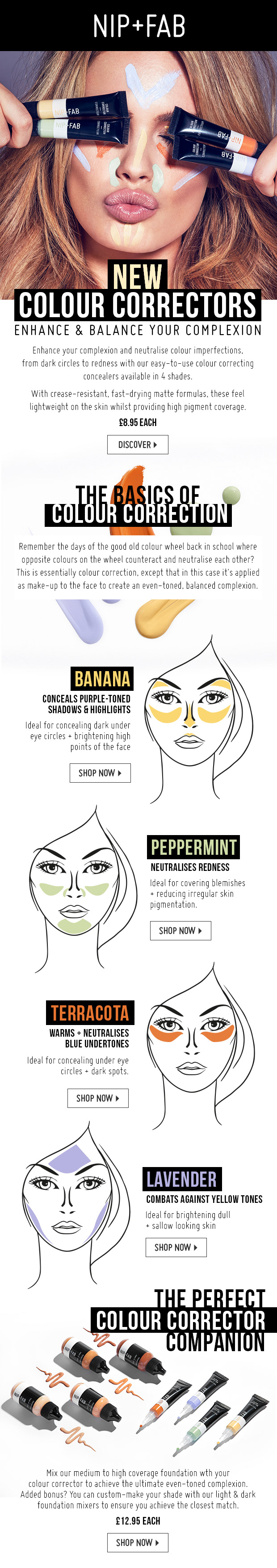
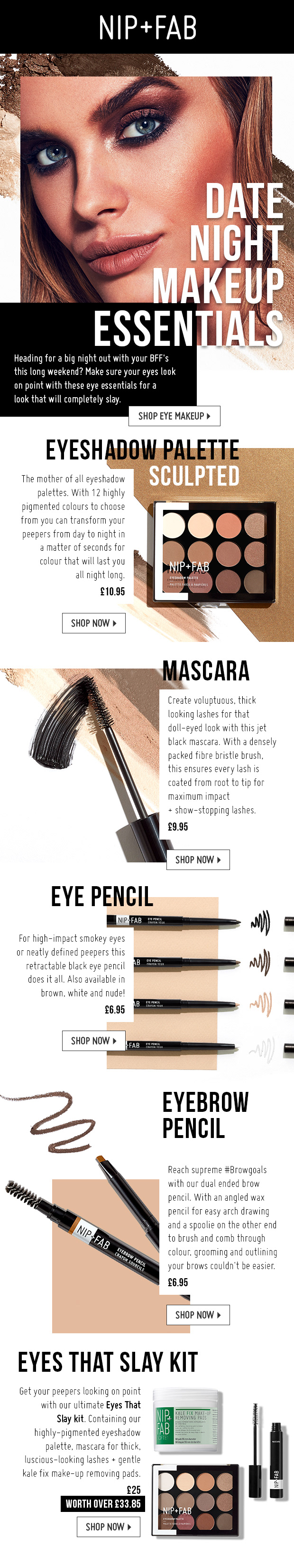
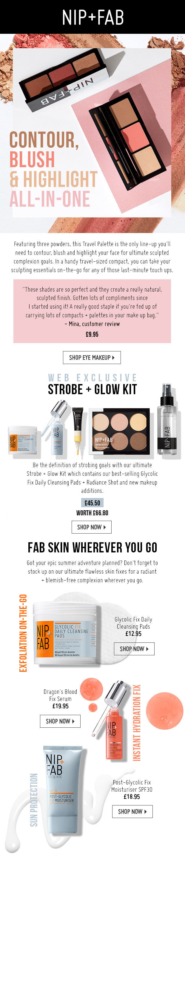
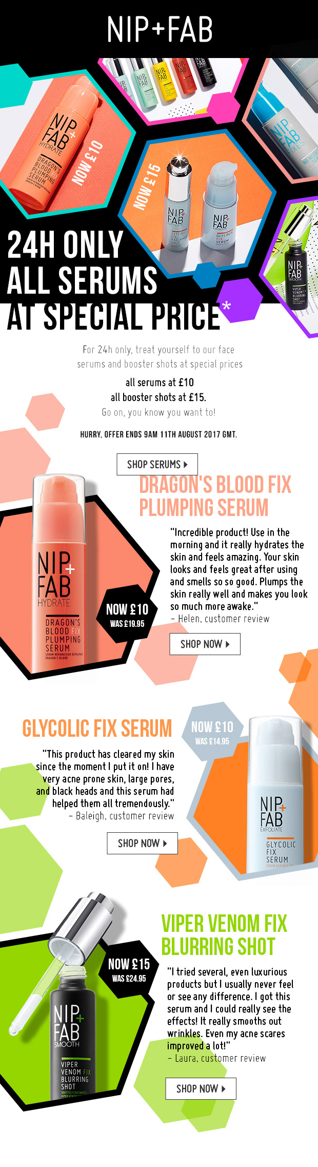
Nip+fab newsletters
Here are examples of editorial style newsletters designed with the intention of educating the consumer on how they would benefit from the product in a visually digestible, and eye catching way, ensuring the fun, playful branding strongly featured, and key messaging was clearly communicated.
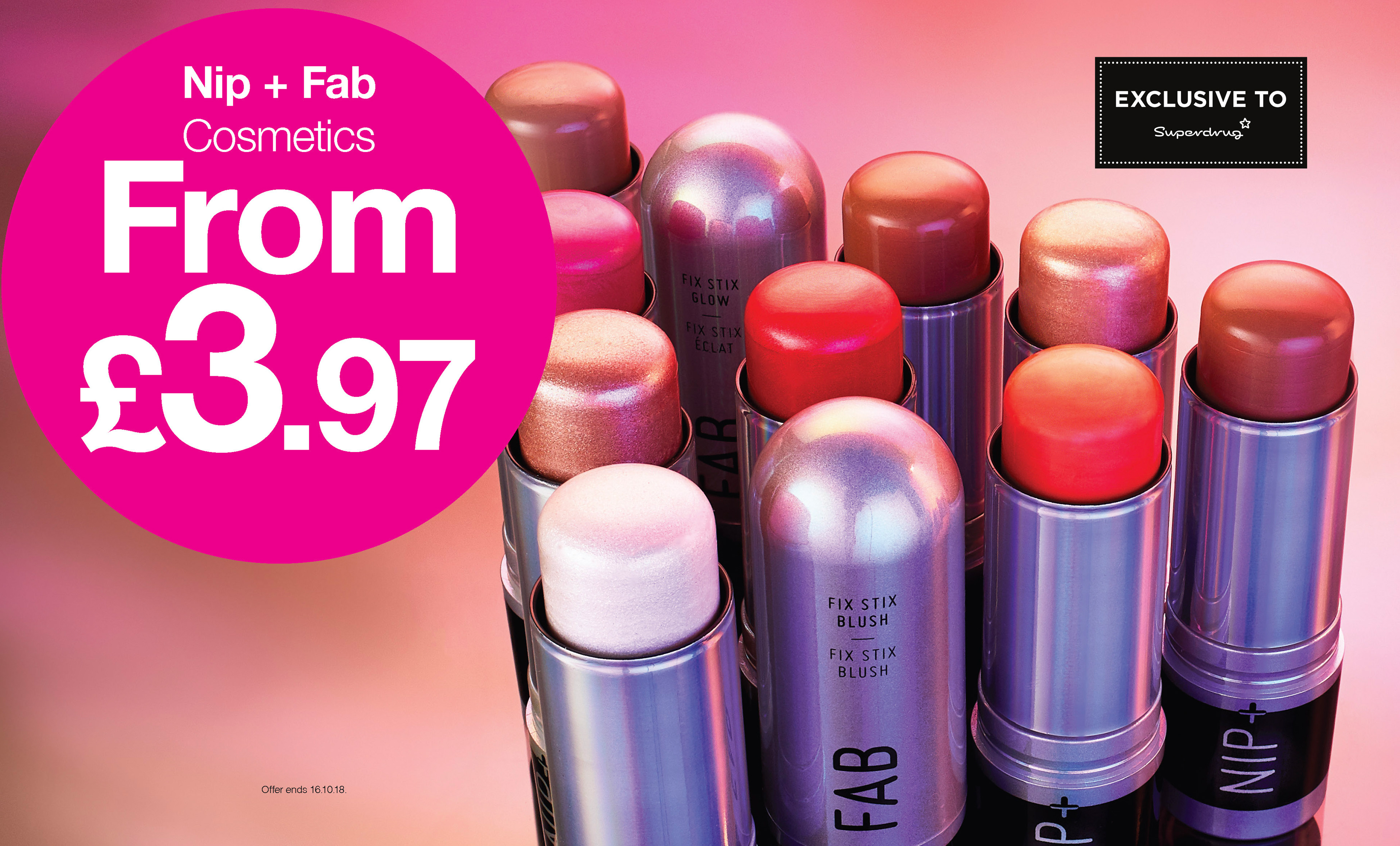

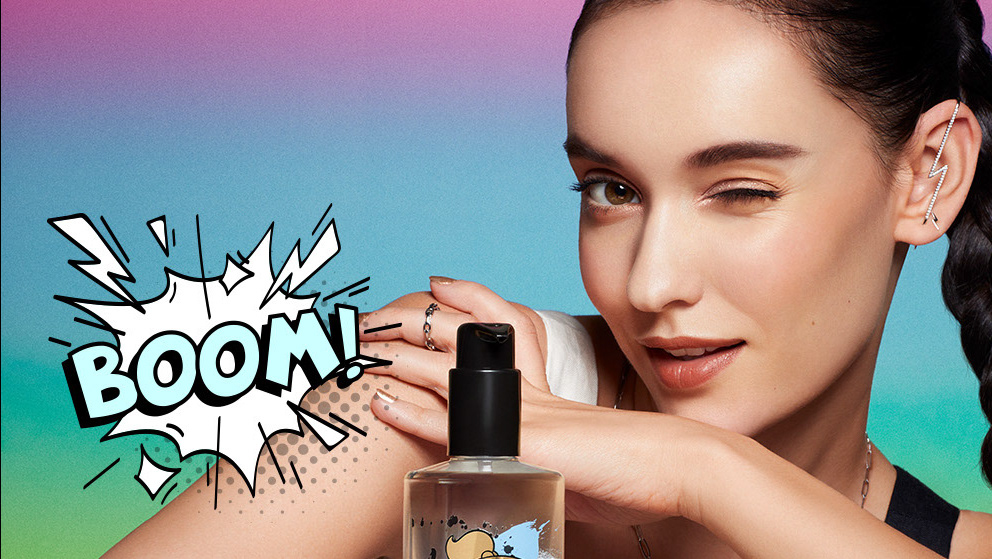
Nip+Fab superdrug hotspots
These are Superdrug hotspots used as artwork to reinforce the brand behind the products. It was super important to use impactful visuals of the products and texture shots to elevate the product as well as educating the consumer.